context
Freelance work
responsibilities
Customer research
Usability testing
Interaction design
Visual design
Prototyping
overview
ProtoXYZ is a rapid prototyping startup founded by two Northeastern University graduates.
I teamed up with the founders to improve the user experience of their service. This was an important aspect of their product since there are so many competitors in the space.
impact
By creating a tool to match customers with the appropriate material for their 3D print, I made it easier and faster to complete a purchase.
Identifying focus areas through user research
My first step when working with ProtoXYZ was to uncover any pain points within their ordering process and organize priorities for future work.
I conducted usability tests with five engineers who have previously used online prototyping services in order to get feedback that would truly represent our user base. The testing focus on five key areas.
01
02
03
Navigating the homepage
Uploading a part
Comparing Configurations
04
05
Exploring material offerings
Configuring a part
The sections of the usability testing where the most confusion was observed were Exploring Material Offerings and Comparing Configurations. In this case study, I will be detailing the work I did to improve the process of Exploring Material Offerings.
The problems
Synthesizing the feedback I received from my research, I identified three major problems with the materials exploration process.
Setting a benchmark
To quantify the severity of the problem and make sure future designs were an improvement, I used a system-usability to measure participants experiences with the site.
By assigning a numeric score to each response (with "Strongly Disagree" being 0 and "Strongly Agree" being 100), I calculated an average agreement score for each statement.
01 - It was easy to navigate the material offerings by ProtoXYZ.
40% agreement
02 - Once I knew which material properties I wanted, it was easy to find the best material.
40% agreement
06 - I faced no obstacles when trying to locate the best material for my part.
40% agreement
Wireframing
Before jumping straight into high-fidelity designs, I created wireframes to brainstorm potential solutions to solve the problems I uncovered.
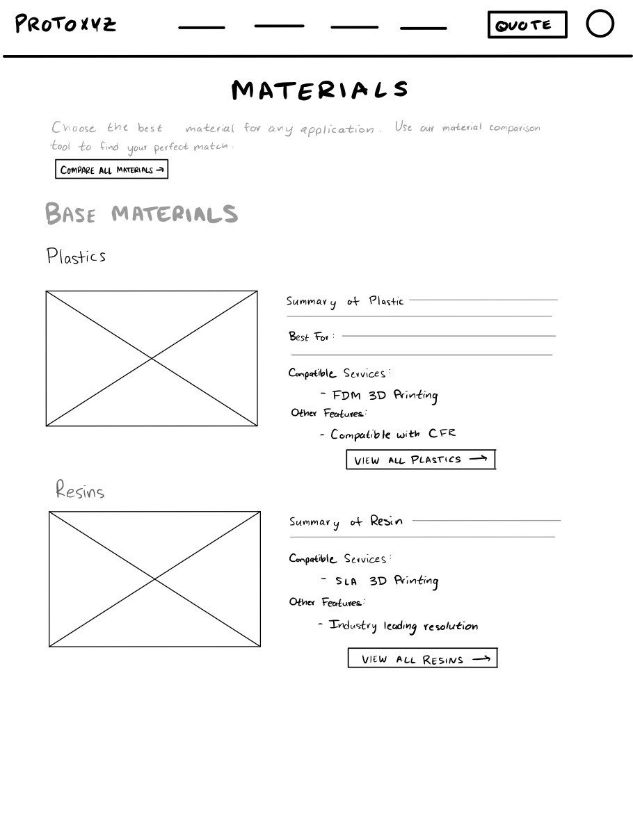
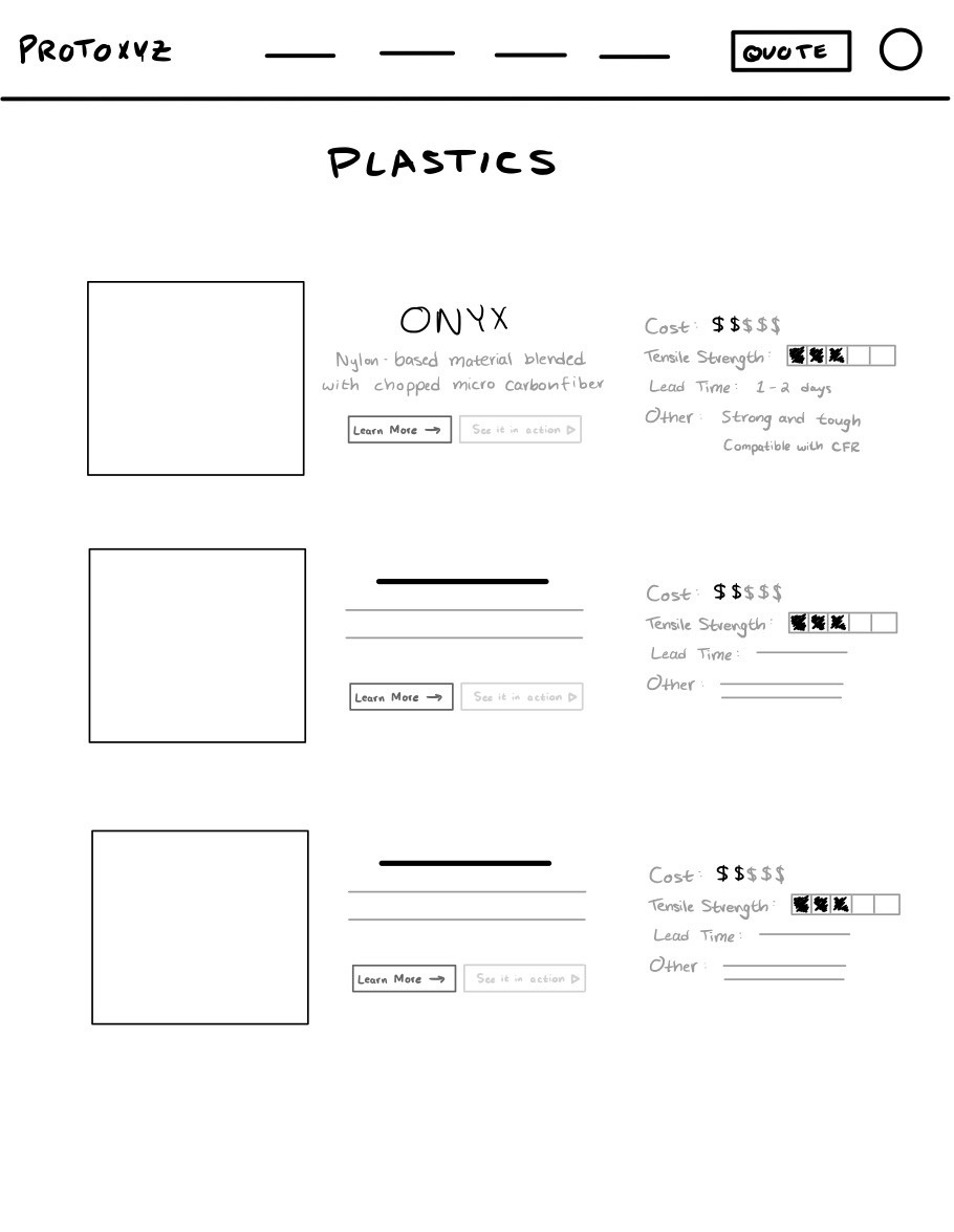
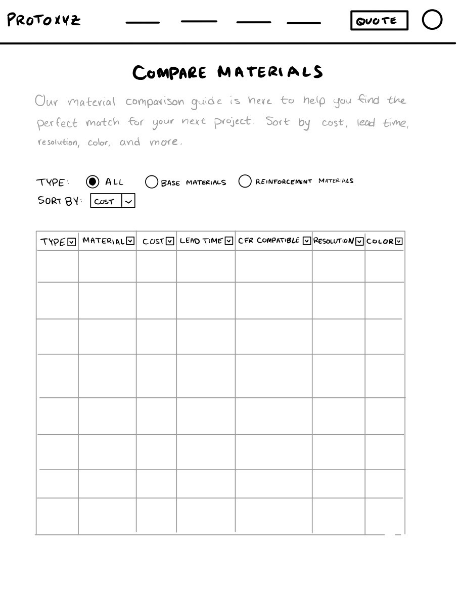
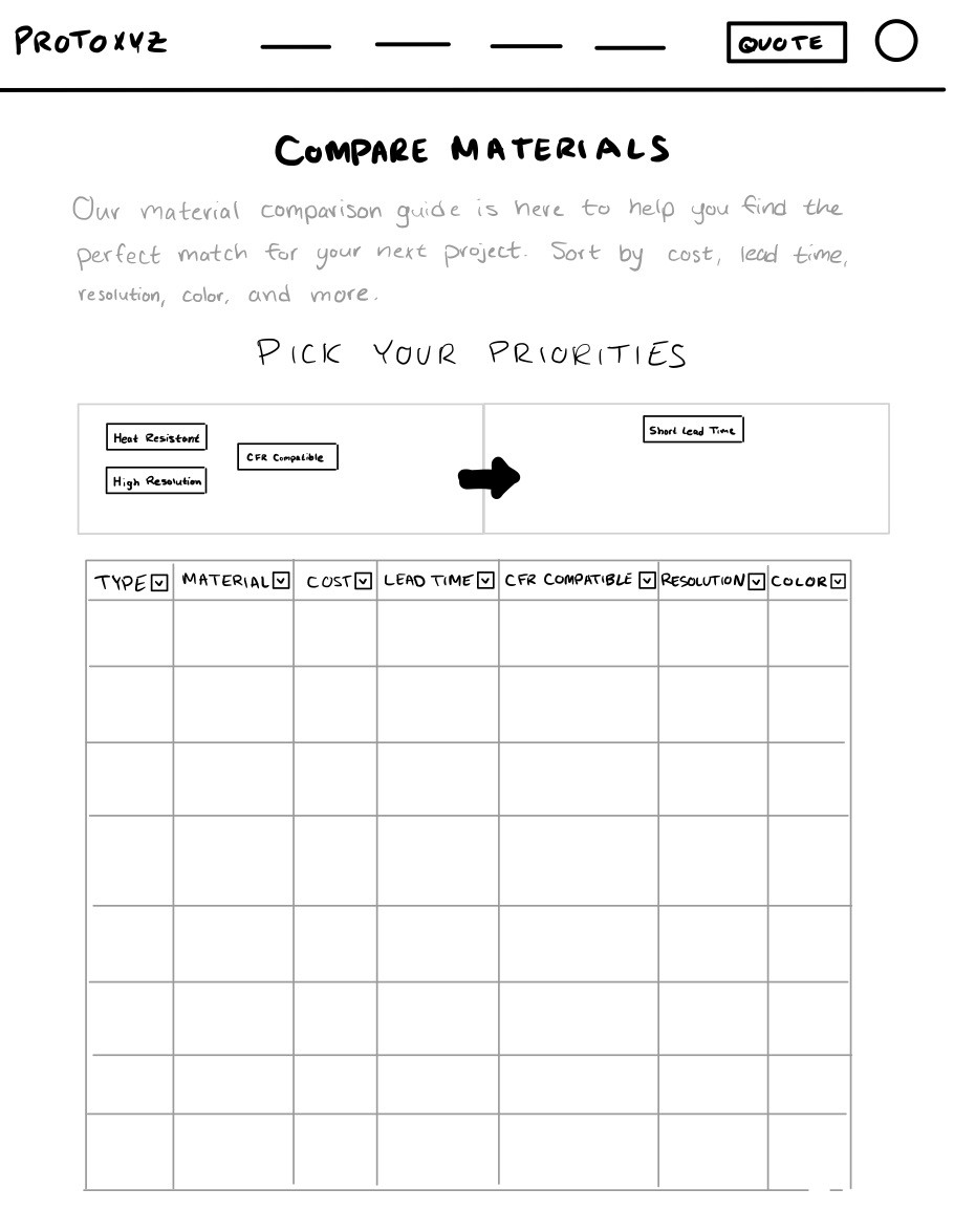
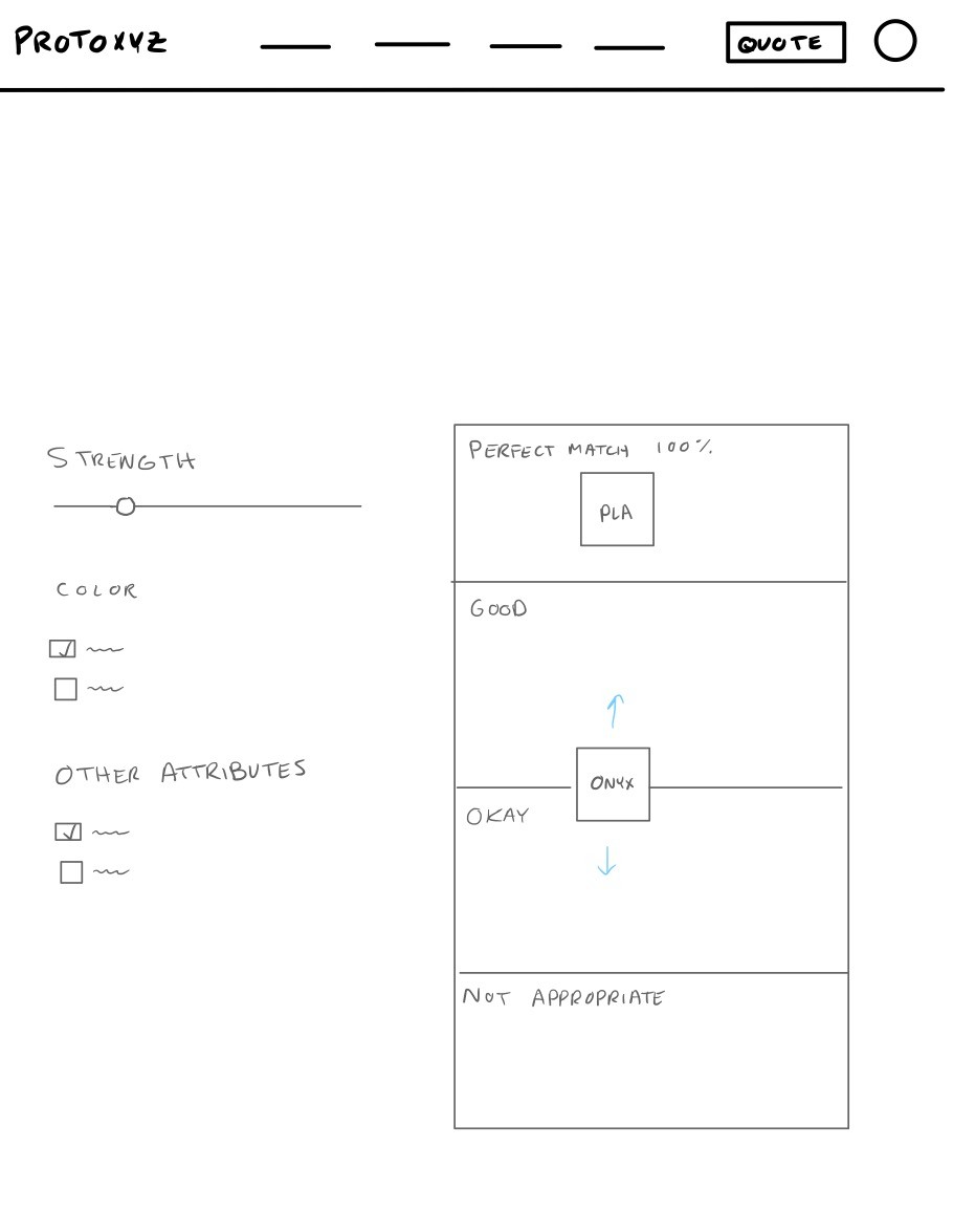
My wireframes for the Materials page explored different ways of formatting the information to be clear and concise, while the Material Finder tool wireframes explored different methods of interaction like dragging cards, adjusting sliders, and more.
Materials page
Material finder tool
Materials page
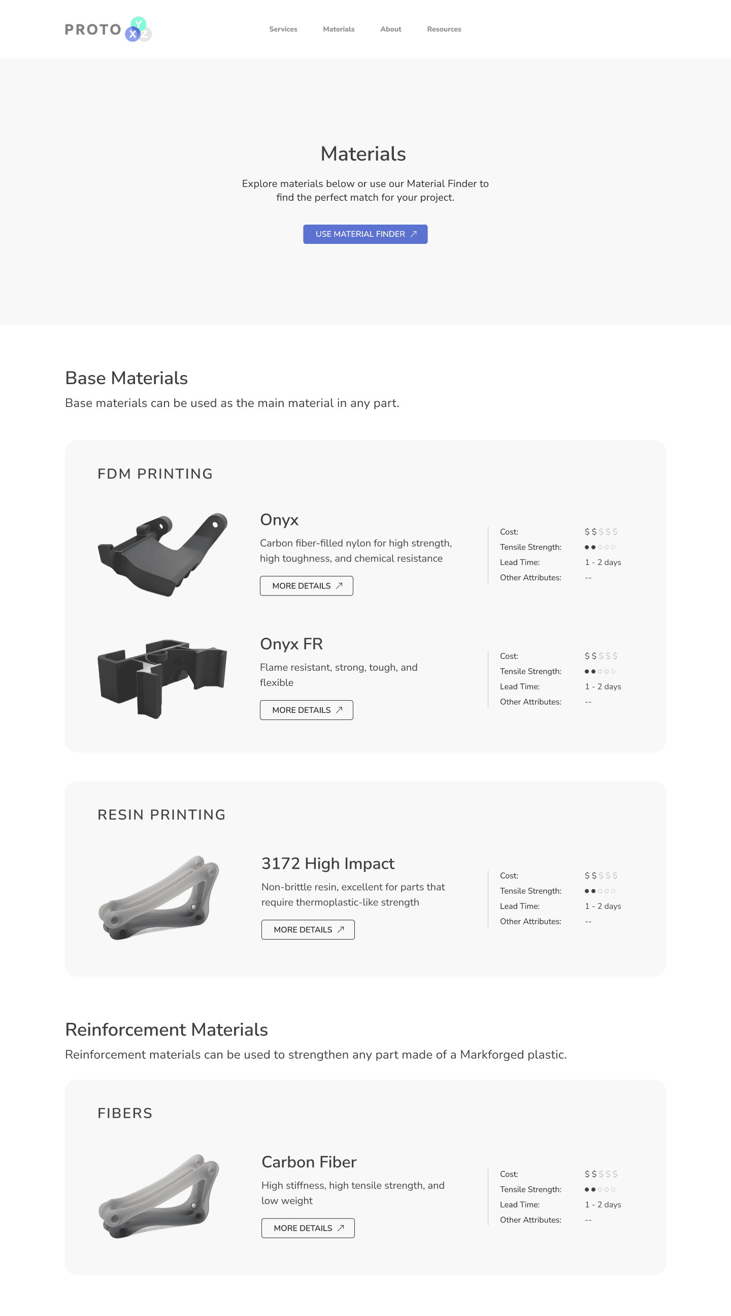
When redesigning the material page, I prioritized improving users' ability to distinguish between material types.
To create a clear separation between plastics, resins, and fibers, I used the Principle of Common Region and added a light gray container to group the categories. I also separated materials by Base and Reinforcement types to make that distinction clearer.
Lastly, the data displayed in each box was filtered down to just the most important items with a prominent call-to-action to let the user find more information. This change made the design more scannable so users could quickly differentiate between options.
Material finder tool
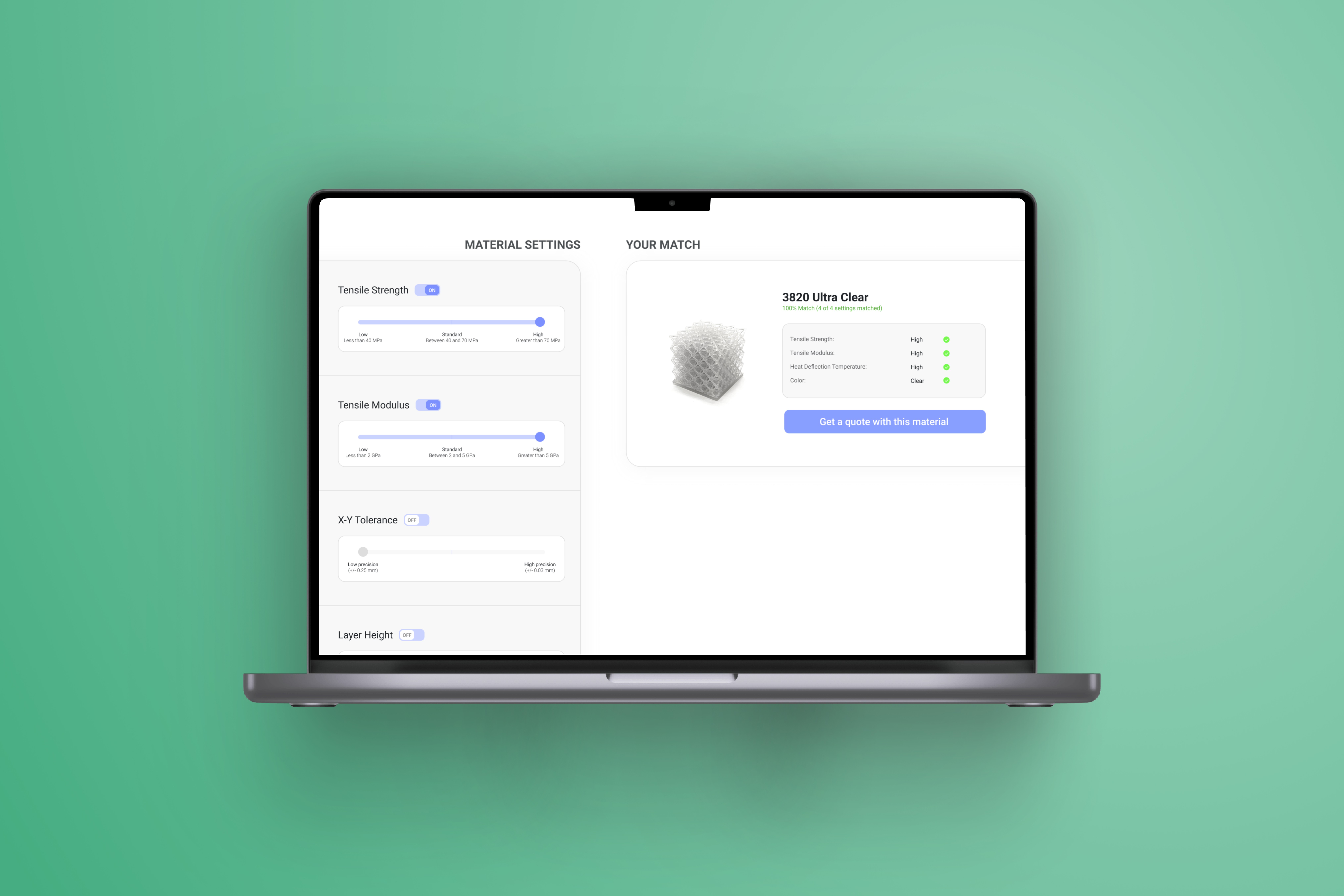
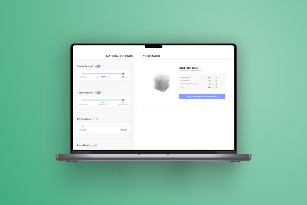
The second solution I created was the Material Finder tool. This allows users to input values for a number of material properties and what setting they need for each. Then, the information is compared to the material library to calculate the best match.
To get a unbiased comparison of user feedback between the existing site and the new material finder tool, I wanted users to test a high-fidelity prototype. This way, they would not be biased by placeholder information or visual aesthetics.
Material finder tool testing
I gathered feedback on the Material Finder tool through moderated usability testing. Throughout the session, users were guided through a series of interactions with the prototype followed by questions where they could share feedback.
At the end of the session, participants were once again asked to indicate how much they agreed with my KPI statements regarding their experience. In addition, I added some new KPI's specific to the Material Finder tool that would be used in any future iterations.
01 - It was easy to navigate the material offerings by ProtoXYZ.
Previous: 40% agreement
New: 86% agreement
02 - Once I knew which material properties I wanted, it was easy to find the best material.
Previous: 40% agreement
New rating: 86% agreement
03 - I faced no obstacles when trying to locate the best material for my part.
Previous: 40% agreement
New rating: 72% agreement
04 - The Material Finder tool would be helpful for me when ordering 3D printed parts.
86% agreement
05 - If the Material Finder tool was available to me, I would use it.
72% agreement
06 - I would prefer to use the Material Finder tool rather than look through technical specification documents.
57% agreement
Takeaways
After seeing the feedback from my last round of usability testing, I was happy to see that I succeeded in improving the ease of navigation and in creating a new tool that people were excited to use.
I also gained some valuable experience in working with clients, designing for desktop, and running usability testing that I'll be taking with me moving forward!
