The Ninja Dual Heat Oven User Interface
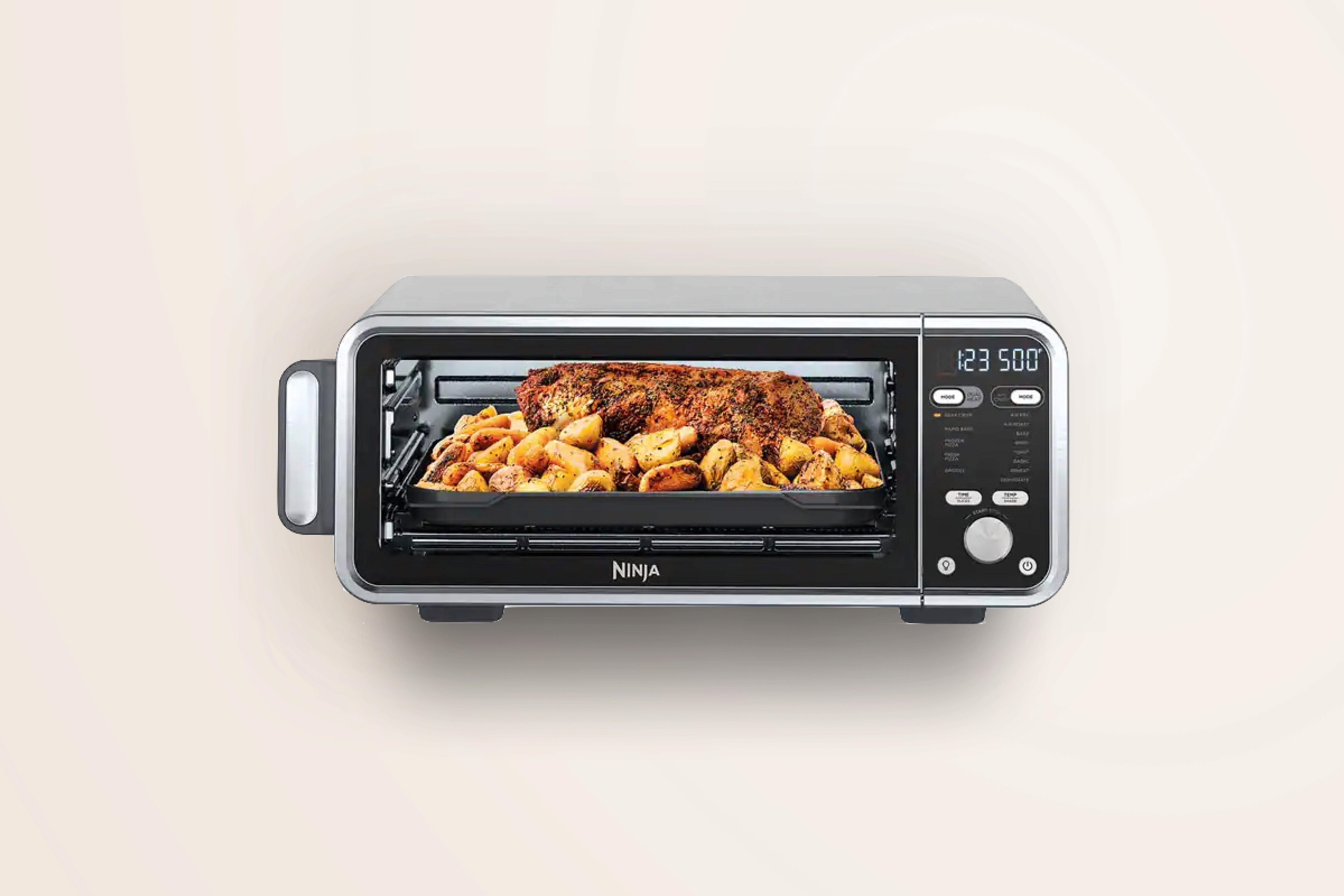
The Ninja Dual Heat Oven is a standard countertop oven with a twist: a directly heated SearPlate that allows for crisping and browning similar to cast iron.
Due to the interdisciplinary nature of my team, I became a key member of the user interface development for this oven. Leveraging my technical knowledge of the system, I pioneered one of the largest changes to the UI and increased our average star rating from a 4.4 to a 4.9.
The First Iteration
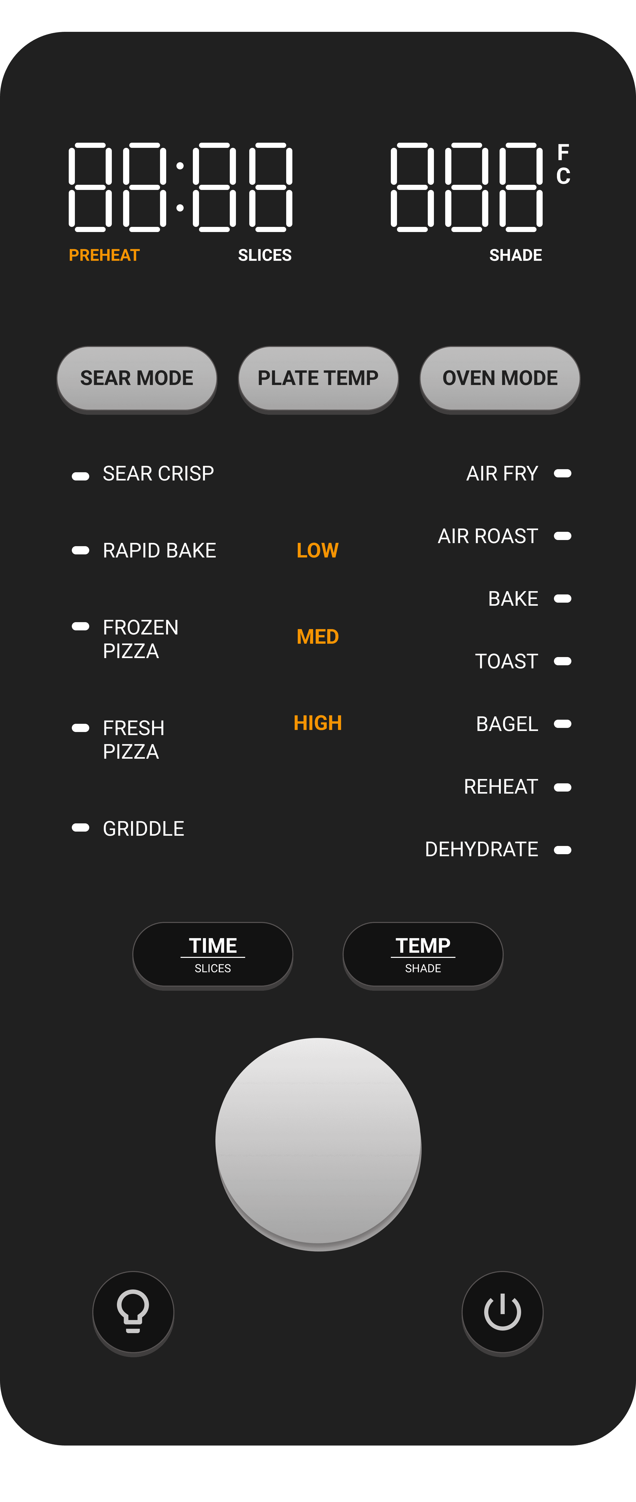
When I joined the team at Ninja, the first iteration of this user interface was already complete. This interface was heavily inspired by the oven's predecessor, with an additional button for Plate Temp. Down the center between both functions lists were 3 levels for plate temperature: low, medium, and high.
In-home User Testing
Throughout the development of this oven, our team sent units out to real consumers to gather feedback. Our first round of feedback with this UI gave our oven an average star rating of 4.4. Though there were other issues at play, the feedback overwhelmingly centered around the user interface.
"The Sear settings need more instructions"
"There are too many functions, it's a hassle to use."
"The Sear functions need too much setup"
Rethinking the Interaction
I became determined to improve this interaction. To do so, I questioned some of the assumptions our team had made along the way. Did the Sear functions really need this much flexibility? Does the current interface allow users to set up scenarios that aren't actually useful? Do users even need the ability to control the plate? I gathered data from the recipe booklets along with some testing and I made two interesting discoveries.
Every recipe that used a high plate setting used a high air temperature and vice versa.
Although our interface allowed users to set a low air temp with a high plate temp or vice versa, our culinary team found that this use case never resulted in high-quality food outputs.
The hardware limitations of this oven prevented a temperature difference greater than 50 degrees between the air and the plate.
Our interface was allowing users to set up scenarios that weren't physically possible.
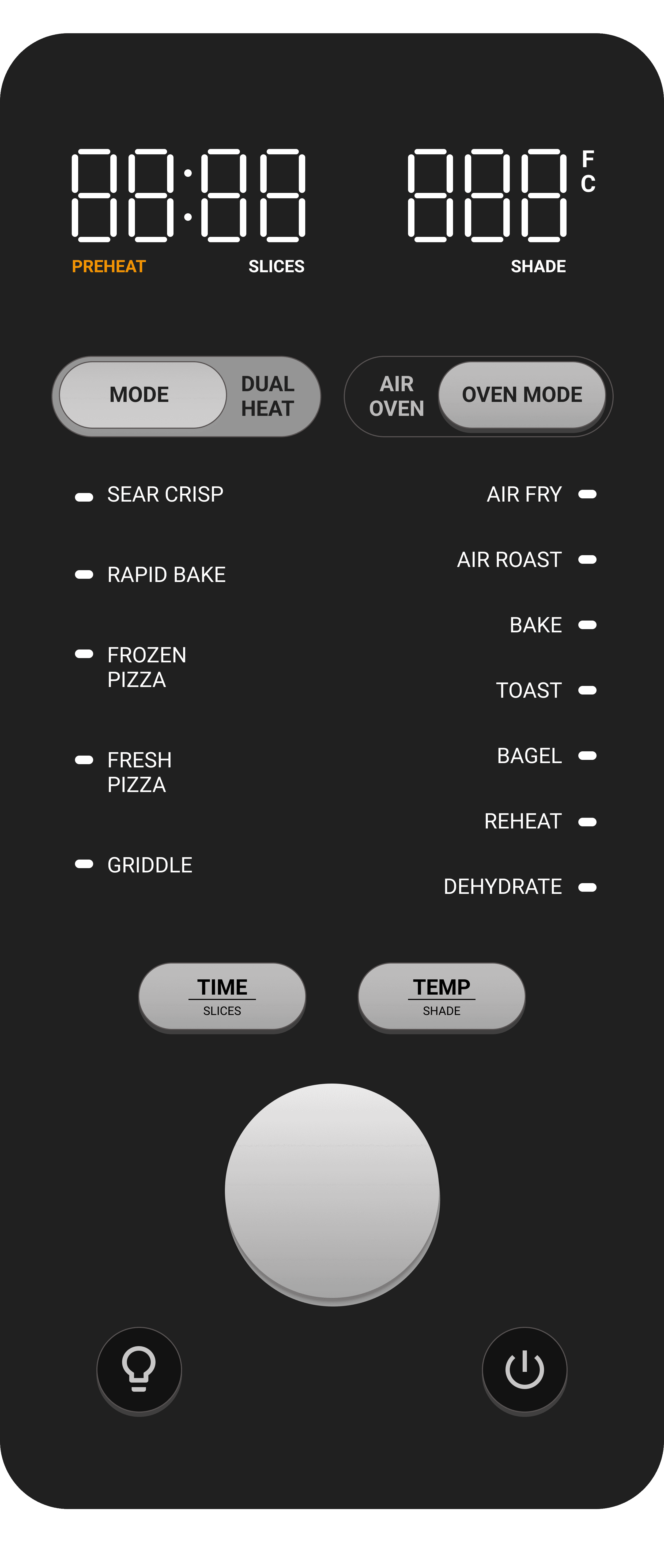
The issues with our interface ran deeper than just user confusion. We enabled impossible scenarios and endless setting combinations while only recommending a small subset that would actually net good results. There was a clear path forward that would eliminate these concerns while simplifying the interface at the same time—we decided to remove the Plate Temp setting.
Before and After
After some meetings to get buy-in from the entire team, our UI designers created the next iteration that we would send home to our customers. Though it felt counter-intuitive to remove functionality from our product, we had substantial evidence that this was the correct path forward.
When we received feedback from our next round of in-home user testing after our UI redesign, we found that our average star rating increased from a 4.4 to a 4.9.
Takeaways
Throughout this process, I discovered how strong my passion for human-centered design is. I've always loved designing products, but this process was one step closer to our users than I typically work and it made me enjoy the process even more.
One of the biggest takeaways I had from this process is that more is not always better. It can be tempting to add as much functionality as possible when designing a product, but that can often lead to an overwhelming or confusing experience. It's important to identify what's important and remove what isn't working.
After discovering my love for designing user experiences and proving myself as a valuable member of UI development team, I became the UX lead for the next oven product. In this role, I continued to gain valuable experience leading weekly UI meetings, holding design reviews, and working closely with our Industrial Designers and Software Engineers during that time.


