The Eververse
The Eververse is a metaverse product born out a need to improve family history documentation, modernize our relationships with our ancestors, and bring family's closer together with new technologies.
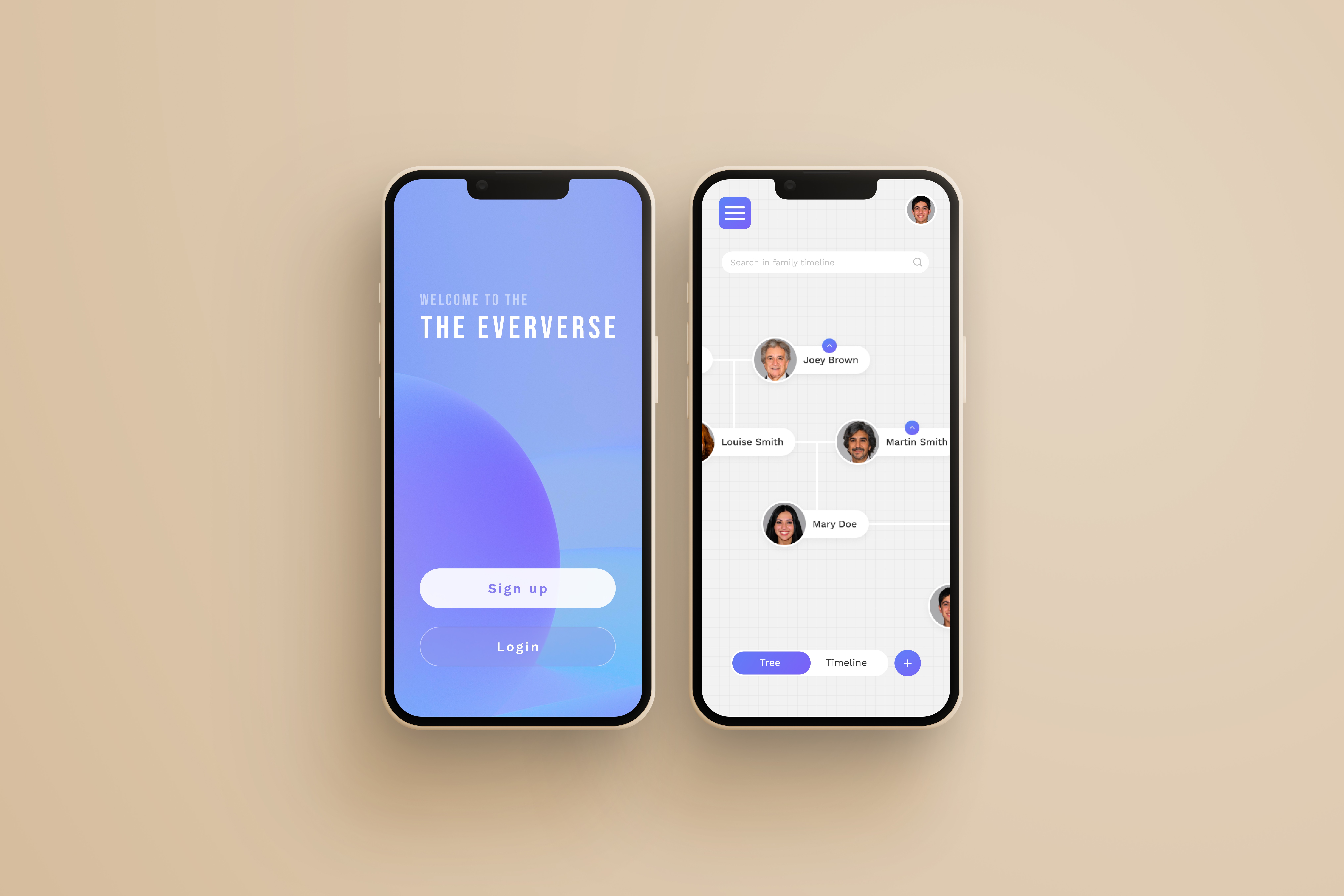
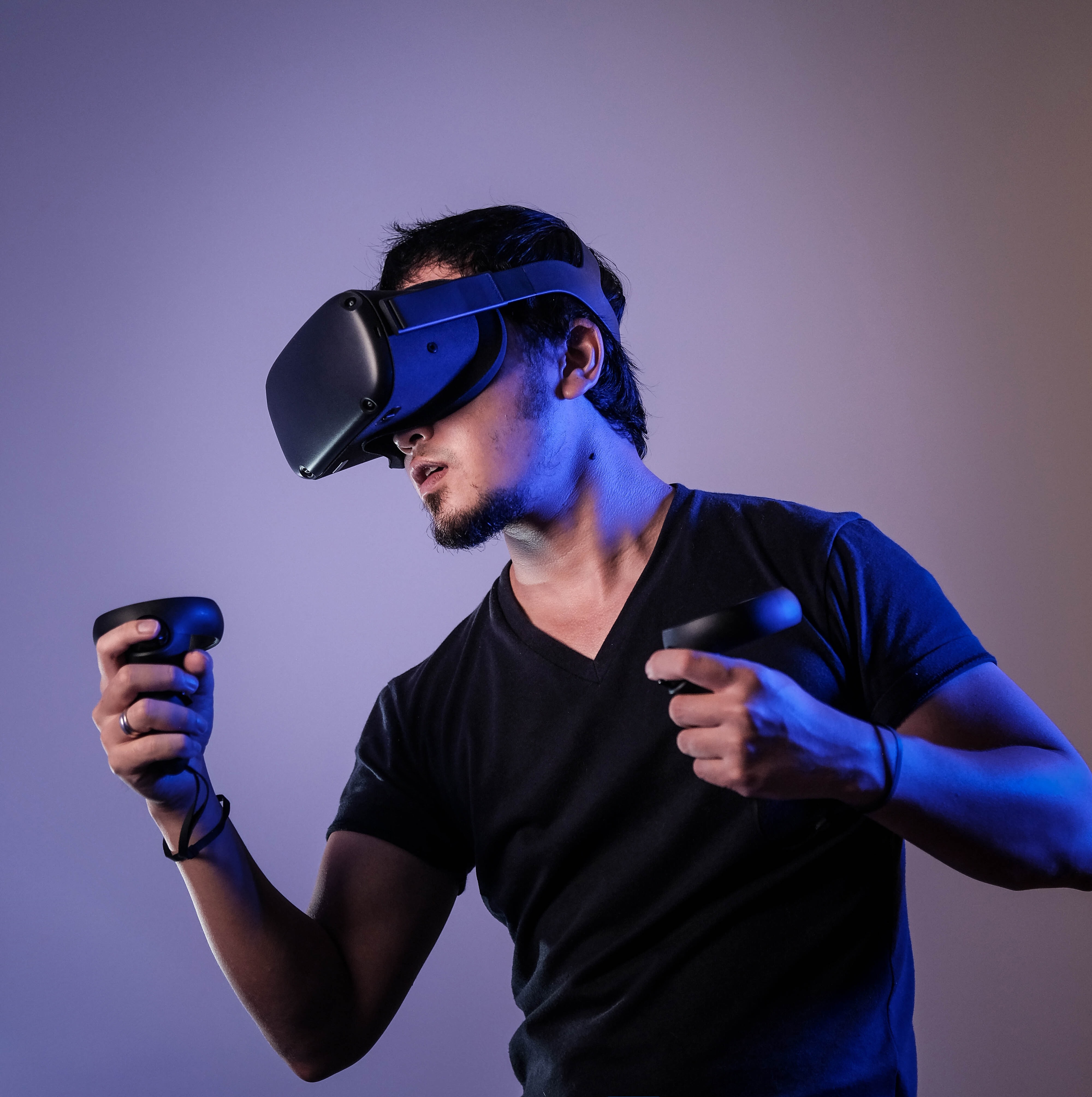
This VR and mobile application lets users document their family tree, archive valuable memories, and interact with their roots in the visceral world of virtual reality.
How it began…
As part of the Avocademy Designathon, my partner and I were tasked with creating a Metaverse product to make the world a better place.
We considered a variety of ideas including an AR app to improve recycling habits, a Metaverse dating app, and many others. We eventually landed on an idea that was inspired by a personal experience I had just weeks before.
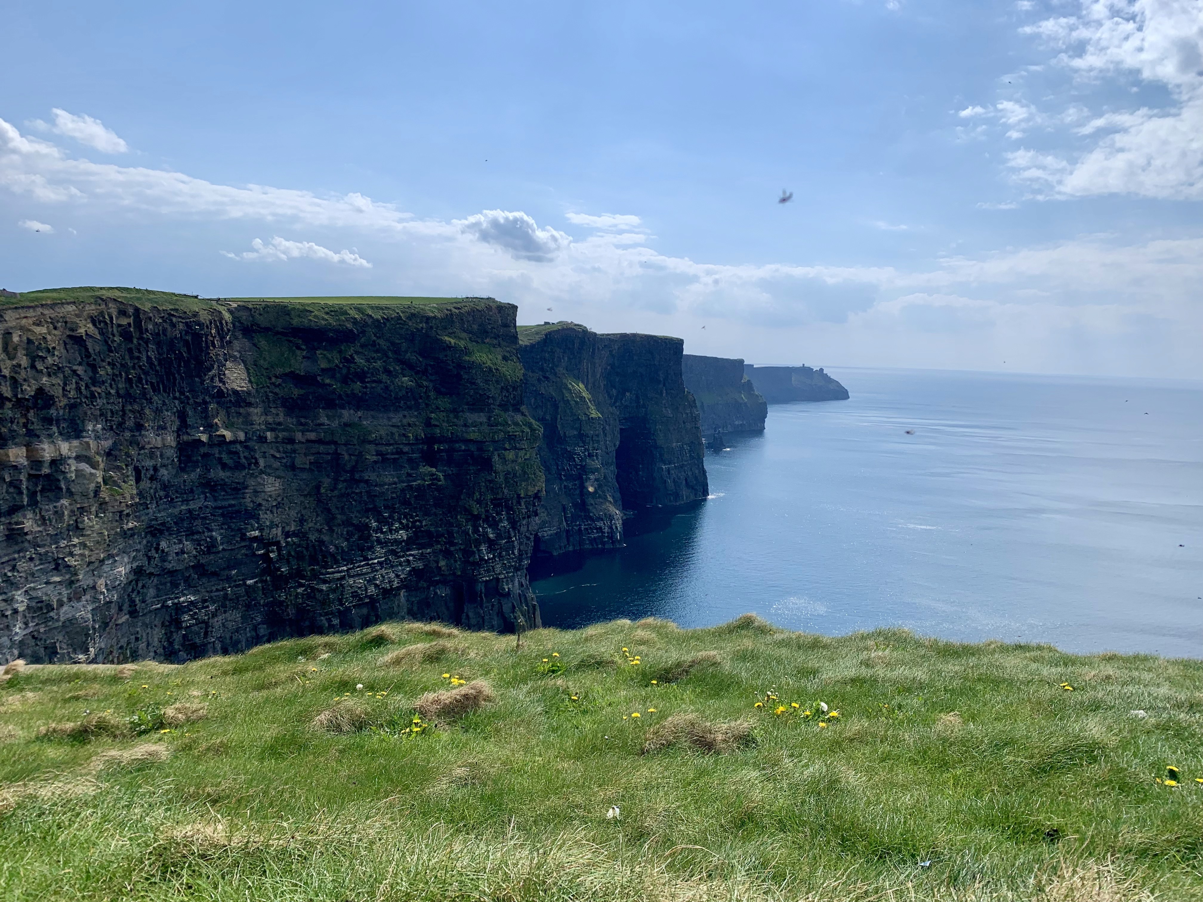
After a trip to Ireland where I met over 50 relatives for the first time, I was floored at how little of my family history I knew.
I wished that my family and I had done a better job documenting our family tree and making it accessible. To prevent a similar experience for others, I was inspired to take action and create a product that could solve this.
User research
To prove that there was a real problem here, my partner and I interviewed five people ranging in age from 23 to 66. In addition to just proving a lack of documented family history, we wanted to prove that other people shared that desire to know more about their family's past.
During our interviews, we uncovered the following:
A desire for more
6/6 participants expressed that they wish their family history was more well-documented.
No plan for future generations
4/6 participants feel that they have not adequately documented their own lives for future generations.
A lack of necessary tools
4/6 participants did not feel strongly that they possessed the tools necessary to document their lives.
Lackluster reliving
3/6 participants feel that photos and videos alone do not let them truly relive the emotions of past experiences.
Varied documentation methods
Participants use photos, videos, voice recordings, and journals to document important memories according to their personal preferences.
User personas
The problem and solution
Our next step was to synthesize all of our learnings so far into a problem statement that captured the many emotions and pain points we were looking to address.
The problem
People need an engaging and immersive method of storing historical family data, documenting their own lives, and reminiscing on past events.
Upon finalizing our problem statement, the solution we would create became apparent to us.
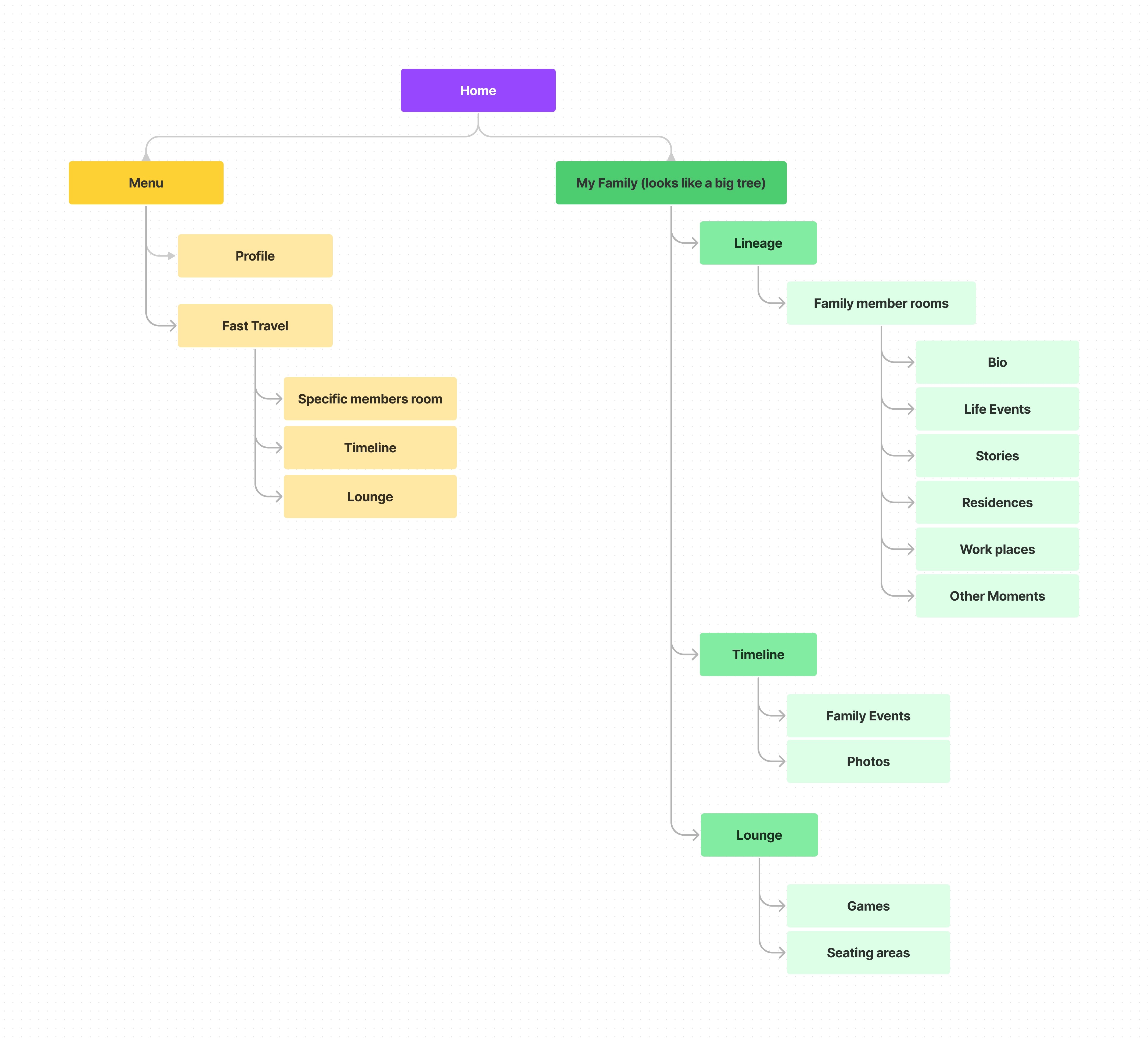
The Eververse VR world
Since the Designathon was just a week long, we decided to focus most of our efforts on the mobile app. However, the contents of the VR space provide vital context for the mobile app design, so the features we conceptualized are as follows.
Wireframing
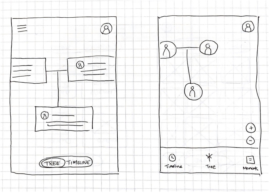
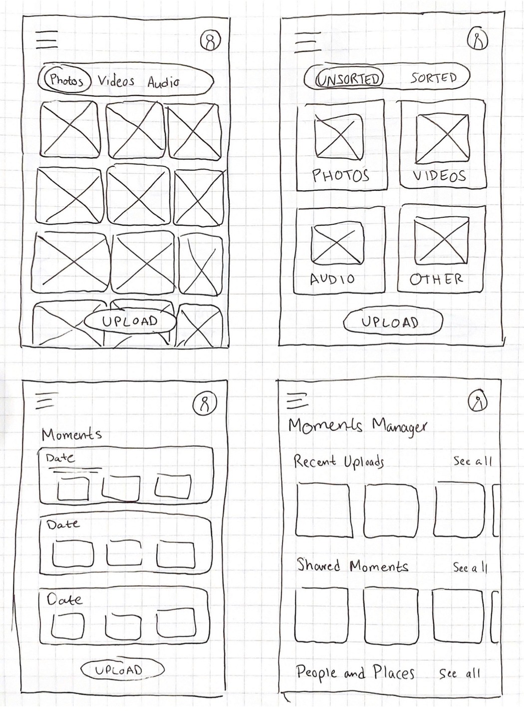
When designing wireframes, I crafted screens that would allow users to build their family tree, upload memories, and connect memories to specific family members or events.
Tree and timeline
Lo-fi Prototype
Usability Testing
Before moving on to a high-fidelity prototype, my partner and I conducted usability testing to identify any areas of confusion that needed to be addressed before moving forward. Here's what we found:
The tree and timeline were straightforward to navigate
No changes were made to improve this interaction.
Only half of our participants found it intuitive to enter a family member profile to add a relative.
To combat this, the "Add" button was carried over from the Timeline page to the tree as well.
Most participants faced no obstacles adding an event to the timeline.
Only participant pointed out an obstacle where adding a birthday could be confusing since this would already be on a family member profile.
Participants liked that it was easy to upload a moment and sort later.
This concept was carried through to the next prototype.
Participants did not understand the connection between actions in the mobile app and VR space.
In the next prototype, specific language around the VR space was included to strengthen this relationship.
Hi-fi Prototype
Utilizing the feedback from our usability testing, I designed a high-fidelity prototype that addressed user pain points and more accurately showcased our final product.
Takeaways
As the week of the Designathon came to an end, my partner and I submitted a recorded presentation outlining our process, concept, and final prototype. Through our hard work over the course of the week, we placed 15th out of over 200 submissions!
One of the biggest takeaways I came away from this Designathon with is the value of talking to users and identify problems as early as possible. It felt like a pretty big undertaking to create an entire concept and multiple prototypes with real usability testing in only a week, but our efforts resulted in a final product that we were really proud of. It forced us to focus on core aspects that would truly affect the user's experience, rather than getting hung up on less critical details. This distinction made all the difference.
