context
Personal project
responsibilities
Customer research
Usability testing
Interaction design
Visual design
Prototyping
overview
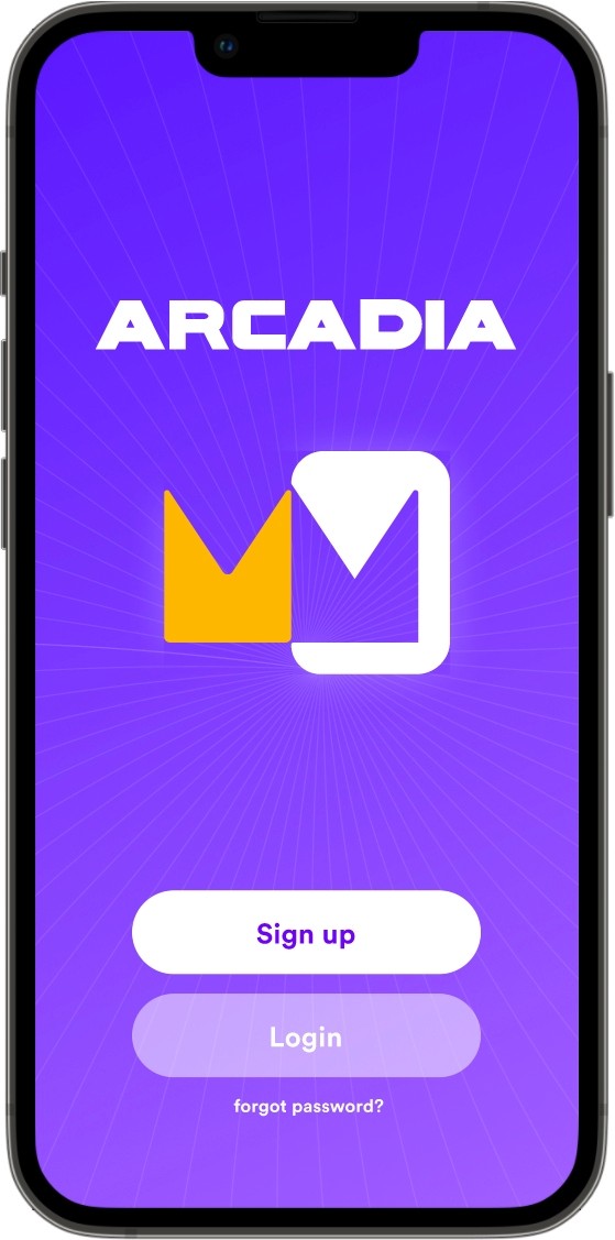
Arcadia is an app designed to improve arcade-goers experiences.
impact
By creating a collaborative gaming experience, I made the arcade experience more engaging and more accessible.
Why arcades?
'Bar arcades' have been growing in popularity in recent years. But as someone who's been to a few, I couldn't help but notice the people around me only slightly invested in the games themselves.
I compared my experiences there to other in-person gaming experiences like escape rooms and couldn't help but feel that something was missing. I set out on a mission to understand if others felt the same way and if bar arcades were missing out on an opportunity for even larger growth.
Interviewing to uncover real problems
Though my personal experiences led me to believe there could be problems in the arcade space, I couldn't rely solely on my own opinions.
To ensure I was solving a real problem, I embarked on user research by interviewing five individuals who had previously visited an arcade. Despite different levels of gaming ability, I found common threads regarding what frustrated arcade-goers, what motivated them to play games, and how they felt arcades compared to other social gaming activities.
frustrations
"By the time I figure out what I wanna do, I wasted all my money on Flappy Bird."
"I honestly feel really lost when I get to an arcade. Whenever I get there, my friends just scatter."
"I'm not really a gamer, so if my friends are busy I don't really have motivation to play anything."
motivations
"I like multiplayer games—it's really more about playing with friends than competing."
"I just have a natural instinct to win, it's kinda an innate thing."
"I love games with a low barrier of entry, things you can be bad at but still get lucky sometimes."
how it compares
"Compared to something like an escape room, arcades are kinda boring."
"I definitely prefer escape rooms. It's better being with a close-knit group and you can't recreate it at home."
"I would rather do escape rooms. I like that it's a discrete event whereas arcades feel like they have no end."
Synthesizing feedback and discovering a problem
After gathering my interviewees quotes and other observations into categories, it was clear that I had identified some real problems and I was eager to come up with a solution that could help.
I defined three overarching themes to summarize my findings.
Arcade-goers feel overwhelmed and aimless.
Arcade-goers are motivated by collaboration, simple games, and winning.
People prefer social experiences that are unique, organized, and require a higher level of engagement.
I used my three themes to create a singular problem statement.
the problem
Arcade-goers feel aimless, unmotivated, and not socially engaged during their time at the arcade.
Brainstorming a solution
After finalizing the problem statement, I immediately began coming up with solutions.
tournaments?
People are motivated by the prospect of winning.
scavenger hunts?
A list of pre-tasked could reduce feelings of aimlessness.
arcade maps?
Maps of arcade machines could reduce overwhelm.
machine reservations?
Having specific times to play games could reduce feelings of aimlessness.
leaderboards?
Leaderboards create a social experience and could increase motivation to play.
After some workshopping, I came up with a solution I felt best tackled every facet of the problem I defined.
the solution
An app used at an arcade that guides a group through a collaborative experience in which they must complete challenges to reach a common goal.
Drafting a user flow
To begin defining the major features of the app, I created a user flow. This would help me to envision the app from a high-level and decide which screens I'd need to design.
Open app
SCREEN: Login & sign-up
Login
SCREEN: Experiences and Games
Create a room
Join a room
SCREEN: Game Lobby
Invite friends
Start experience
SCREEN: In-game
Complete tasks
Leave game
Complete experience
Wireframing
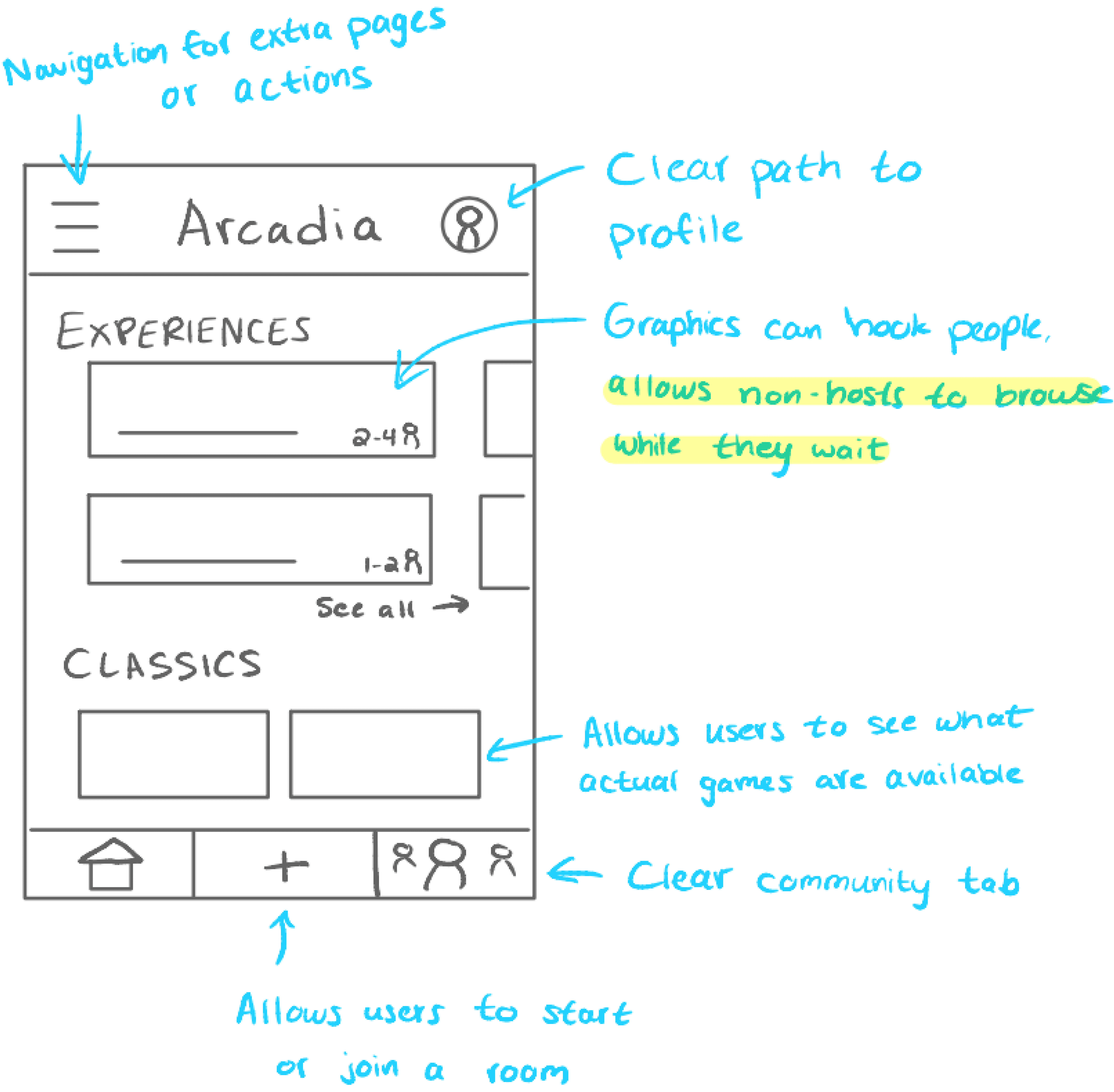
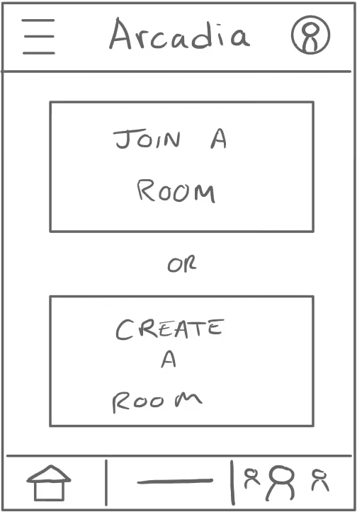
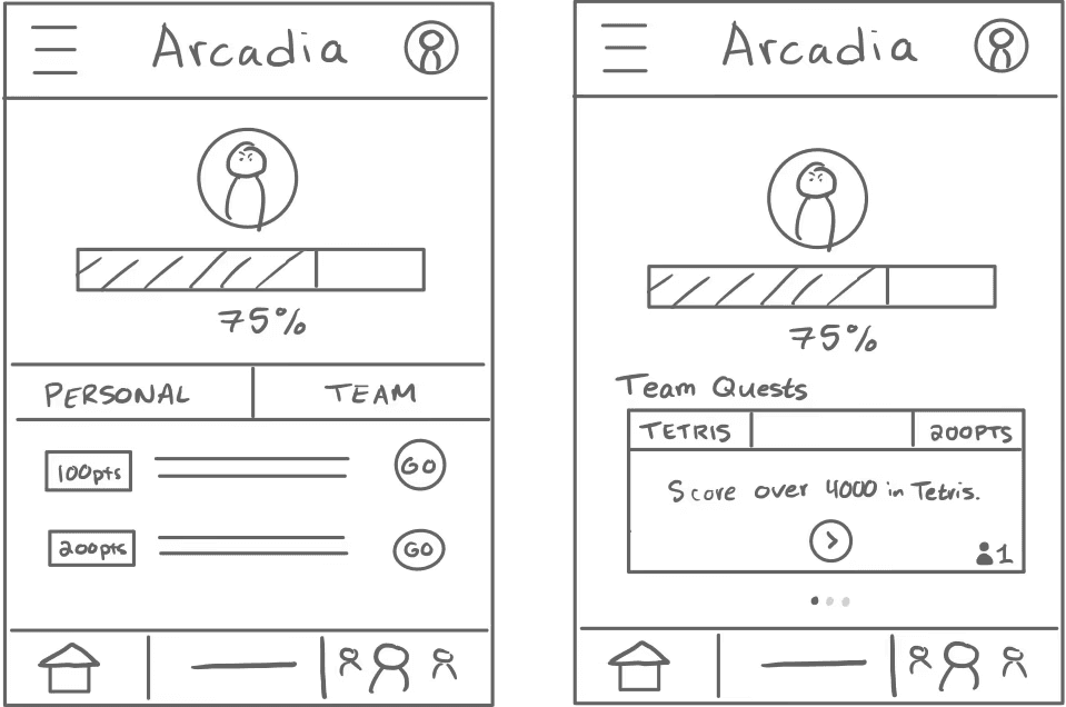
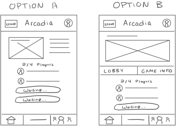
Next, I created wireframes for the most important screens from my user flow. For screens with more complex interactions, I made multiple versions to explore options before moving to the next step.
homepage
game tab
in-game screen
game lobby
Low-fidelity prototyping
My next was to create a low-fidelity prototype so I could conduct my first round of usability testing. My primary goal with testing was to find out whether participants could successfully complete the major tasks before investing more time in high-fidelity designs.
01 - Navigating the homepage
The homepage includes "Experiences" and "Games", which describe the guided group activities and a directory of games available at the arcade.
02 - Starting an experience
To start an experience, users can click one to open its details and select "Create a lobby."
03 - Navigating the in-game screen
The in-game screen includes an enemy icon, a progress bar, and lists of solo and team tasks.
04 - Completing a task
Users can log a completed task in the app by clicking "Go" to open its details and "Complete" to finish it.
Measuring success
To benchmark my initial success and ensure that future prototypes were improvements, I used a system-usability to measure participants experiences with the app.
By assigning a numeric score to each response (with "Strongly Disagree" being 0 and "Strongly Agree" being 100), I calculated an average agreement score for each statement.
It was easy to setup and start an experience on the Arcadia app.
80% agreement
The in-game screen displayed during the experience was easy to understand.
50% agreement
It was easy to complete a task in the Arcadia App.
80% agreement
I would be likely to use the Arcadia app in the future.
80% agreement
The Arcadia app would improve my experience at the arcade.
90% agreement
Addressing feedback in a high-fidelity prototype
My first usability test highlighted some clear and actionable feedback that I needed to address in my high-fidelity prototype. Below are some of the changes I made as direct responses to the feedback I received.
01 - Navigating the homepage
Problem
Confusion over the difference between "Experiences" and "Games"
Solutions
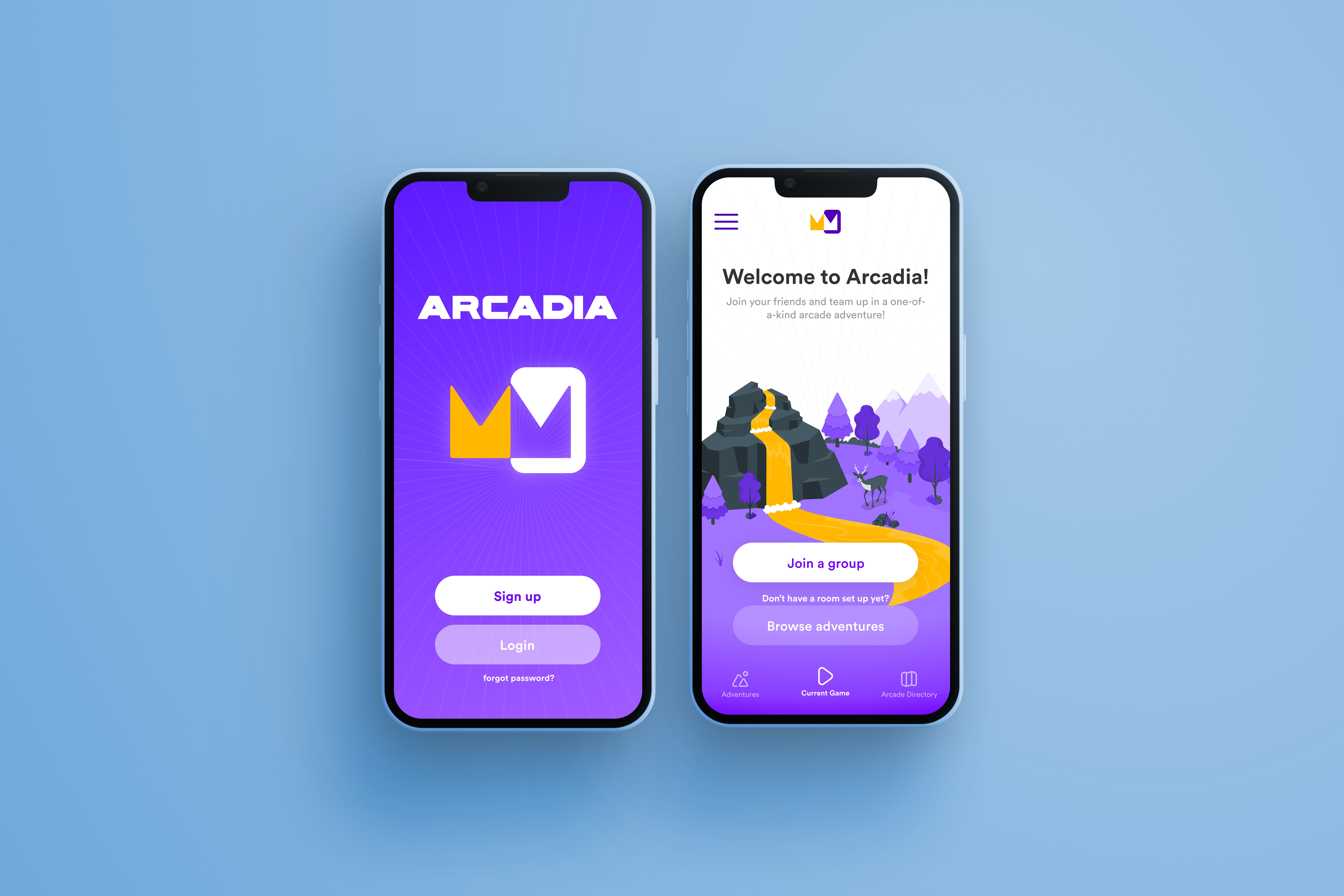
Renaming "Experiences" and "Games" to "Adventures" and "Arcade Directory"
Moving Adventures and Game Directory to separate pages
02 - Starting an experience
Problems
Unclear how to join an already existing lobby
Confusion around how to invite a friend to a room
Solutions
A new homescreen with a "Join a group" CTA
Add a room code and a "Share code" button in lobby screen


03 - Navigating the in-game screen
Problems
Confusion around progress bar and icon
Hesitancy to click "Go" to complete a task since result of button press is not obvious
Overwhelmed by options solo and team tasks
Solutions
Adding an overarching goal with clear relation to image
Updating CTA to "Complete" to indicate that button should be pressed once task is finished
Removing team tasks to simplify experience
04 - Completing a task
Problem
Concerns about cheating
Solutions
Verification step where users take photos and review at the end of each round

Usability testing at the arcade
Though these changes gave me confidence that the new design was an improvement, it was still impossible to know how the Arcadia experience would actually be without ever leaving computer.
I needed to test Arcadia in a real arcade, but there were some limitations of the current prototype that made it difficult. To overcome this, I used Protopie to introduce new features and create a truly functional prototype.

real Task tracking
Challenges are removed from the list once a user marks them as complete.
adjustable progress
Since the participants phones wouldn't be able to communicate, I added an option to increase the group's score manually.


room code verification
With this check, I could realistically replicate the setup experience.
taking photos
The prototype accessed the participants' cameras so I could test the experience of documenting their scores.


animated story-telling
This made the experience more engaging and interactive for participants.
How did it go?
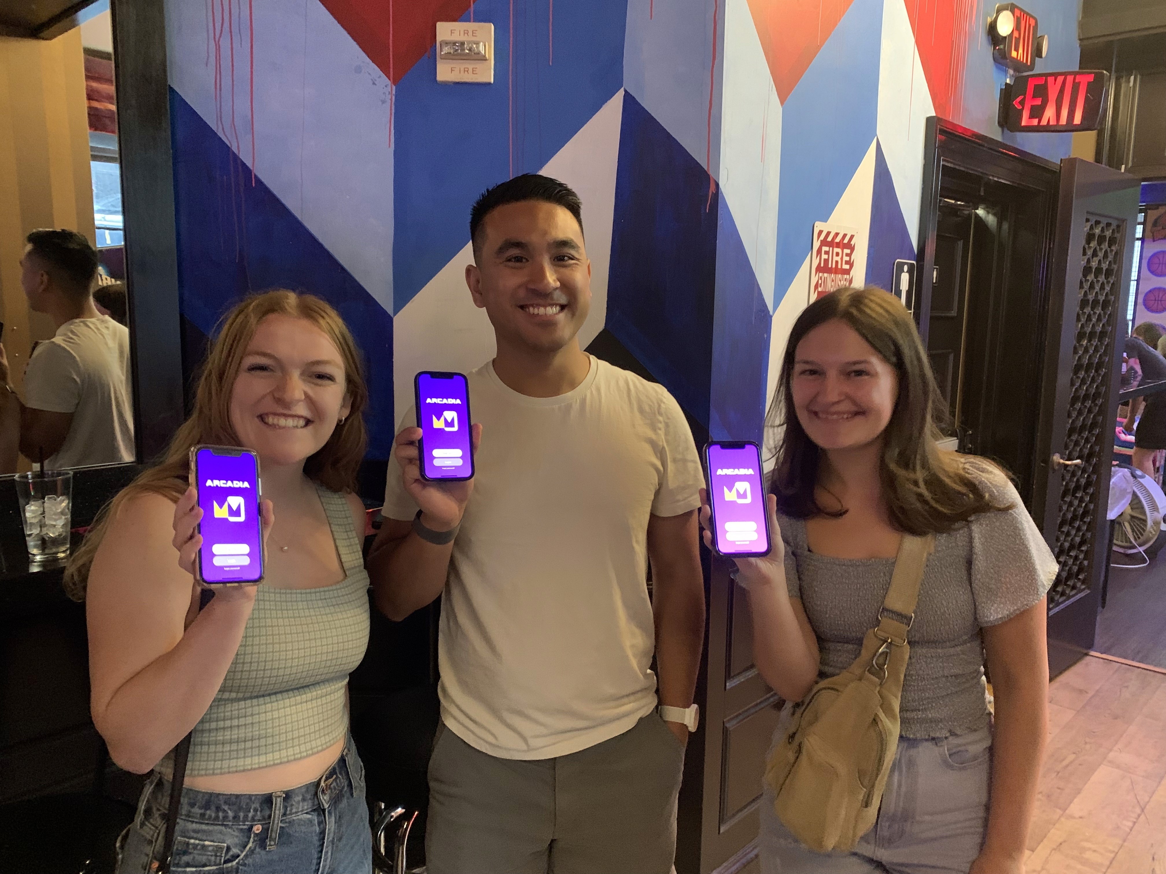
Once my prototype was finished, I recruited some friends to finally test Arcadia at the arcade.
After the user testing at the arcade, I had participants once again rate their feelings in accordance with my KPI's. To my delight, scores improved in all 5 categories!
In addition, all participants responded that they felt more motivated to play games, more organized in their experience, and that they would be likely to use the Arcadia app again if it was offered at the arcade.
It was easy to setup and start an experience on the Arcadia app.
100% agreement
The in-game screen displayed during the experience was easy to understand.
100% agreement
It was easy to complete a task in the Arcadia App.
90% agreement
I would be likely to use the Arcadia app in the future.
90% agreement
The Arcadia app would improve my experience at the arcade.
90% agreement
Takeaways
My last round of usability testing proved that I accomplished many of the goals I had set for myself in the beginning of this project. My feedback had become more positive between prototypes and showed that I solved the problem statement I identified in the beginning of this process.
I also learned a ton of more advanced prototyping techniques that progressed my project in a way that would've been difficult if I avoided the challenge. Sometimes the only way to improve is to struggle through a challenge and I'll be sure to take that lesson with me moving forward from this experience!
