about
role
responsibilities
overview
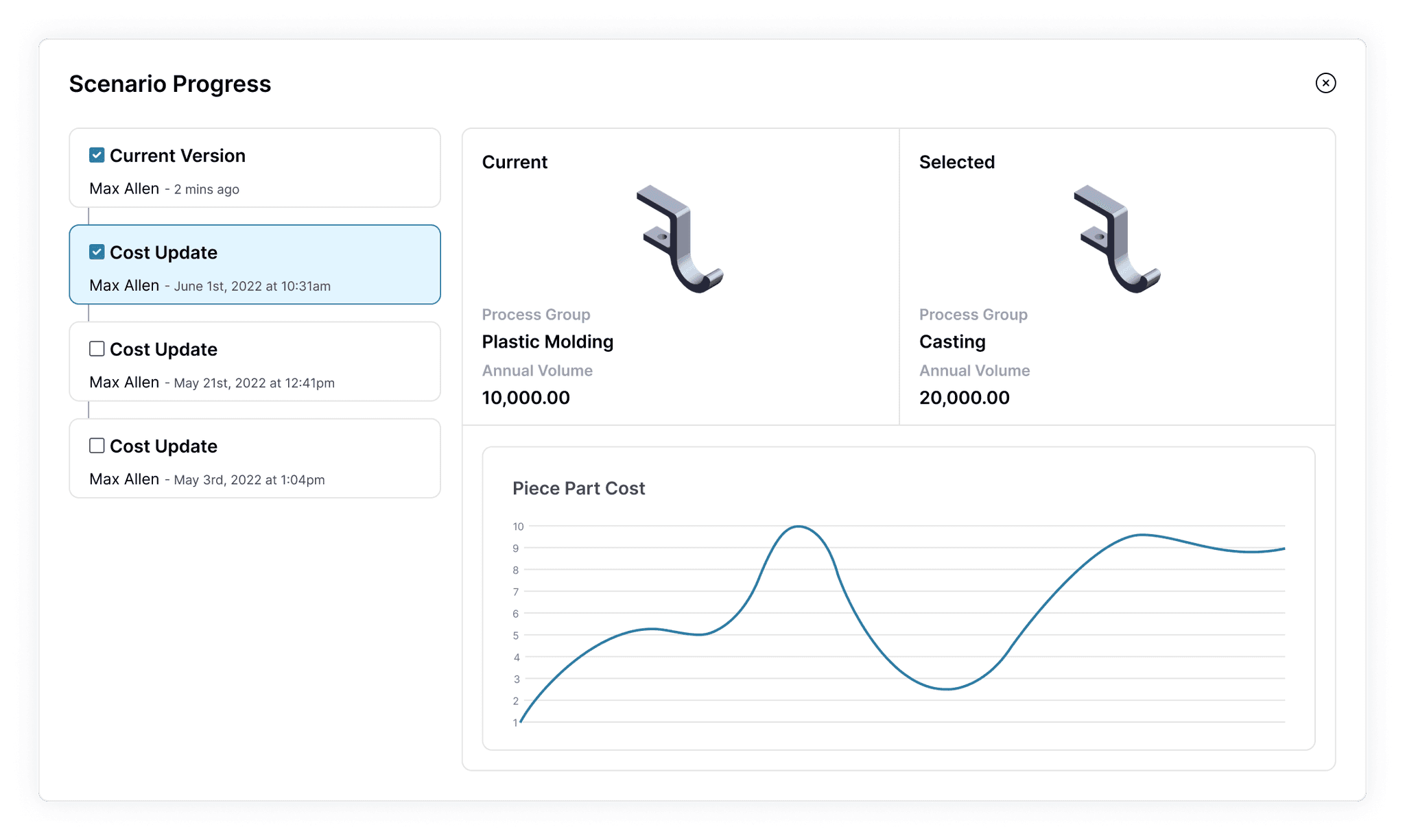
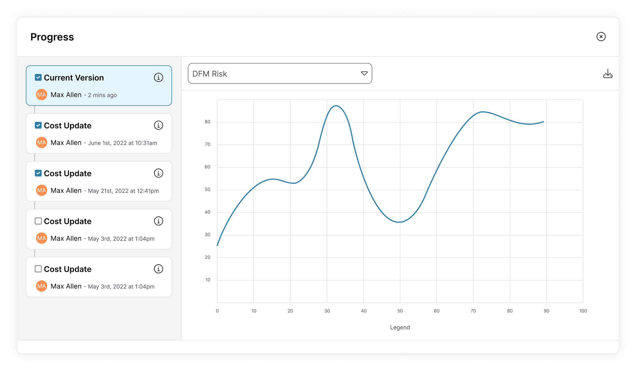
I led the design of a version history feature with integrated data visualization to prevent lost work and help mechanical engineers present to their stakeholders more efficiently.
impact
The feature I designed saved time for our customers, increasing their return on investment in our product.
highlights
The creation of the version history feature was an iterative process with many rounds of designs and interviews with our customers.
My work paid off when we saw adoption of the feature increase for 6 months straight after release.
“[Customer] saw the new chart in aP Design and loved what it provides… When they saw the release notice, they got very excited.”
Customer Success Manager
“Pretty cool! This will definitely help us.”
Customer
"This is sick functionality.”
Customer
We even had some customers and co-workers reach out to let us know how much they loved the feature.
This proved I met the goals I set out to achieve from the very beginning.
To save our customers' time…
To make our product easier to use…
…and to increase the value of of aP Design.
Keep reading for a deeper look!
My Role
As the only UX Designer on the team, I was responsible for conceptualizing the feature, creating high-fidelity designs, and conducting user research. I also worked in collaboration with a Product Manager, Developers, and our Marketing team to gather support for decisions along the way.
What is aP Design?
aP Design is a B2B web app where mechanical engineers can simulate the manufacturing process of parts they design.
To simulate a part, they go through a simple process:
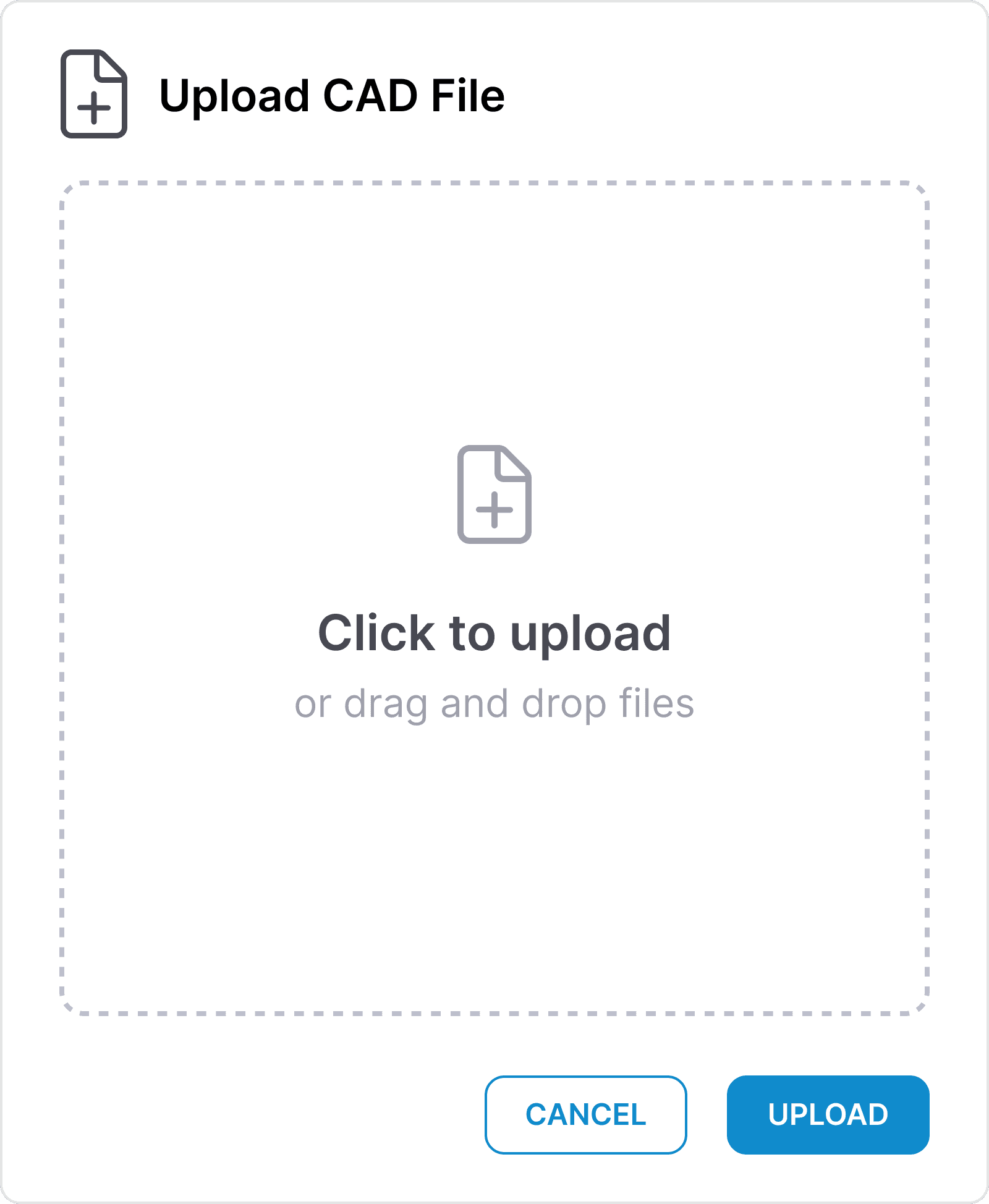
Upload a 3D model
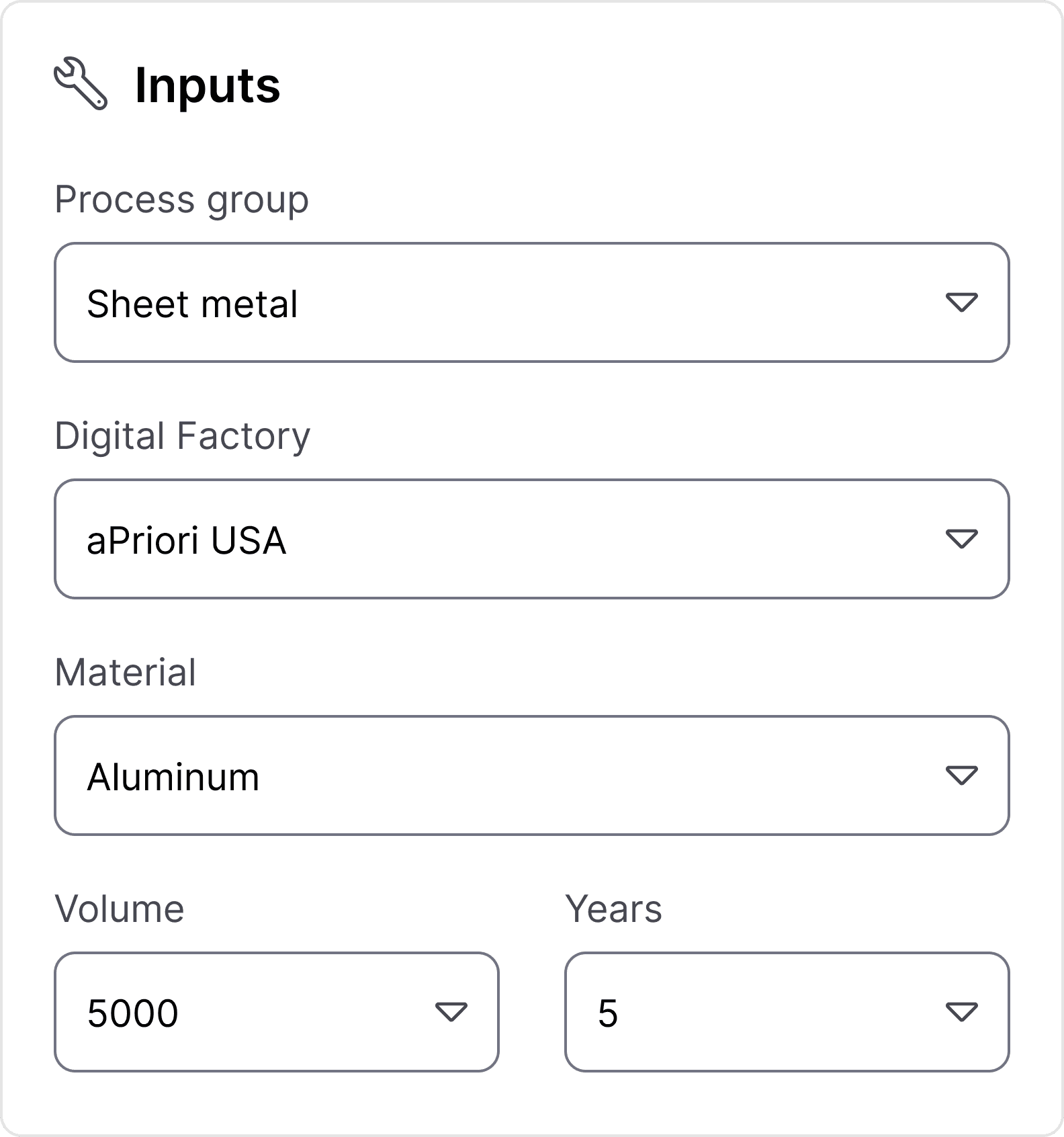
Configure inputs
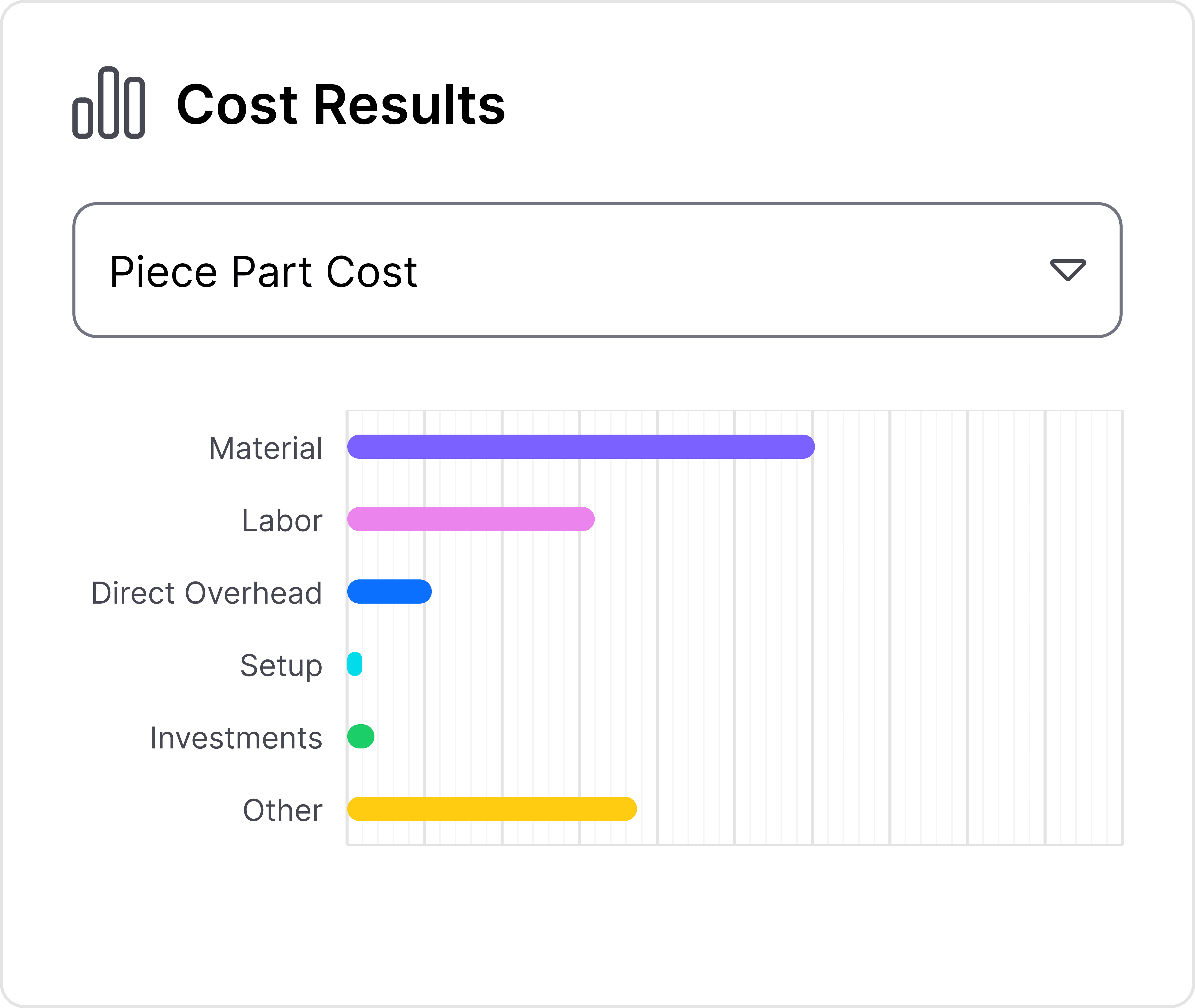
Run the simulation
The Problem
aP Design was really valuable to our customers when it succeeded in saving them time and money, but UX issues limited how fast they could work.
My PM and I noticed one problem repeatedly mentioned in both customers interviews and in support tickets.
The Problem
aP Design users can't access previous simulation results.
So What?
They waste time redoing work and struggle to communicate with stakeholders since they're losing critical data.
Business Impact
One of the main ways aP Design provides value is by saving engineers time. When a usability issue contributes to higher time-on-task, the value of our product decreases.
My Process
Conducting customer interviews to understand our users
It seemed like our users would benefit from some type of version history, but I wanted to learn a bit more about their specific needs before moving forward.
I conducted interviews with some of our major customers and gathered some essential learnings that influenced my design.
Learning 1
aP Design wanted to present past simulation results to stakeholders.
Learning 2
Engineers spent a lot of time creating charts to showcase results to stakeholders.
Learning 3
Design decisions are based on different data for every project.
Creating requirements to guide the design
Using these insights from customer interviews, my PM and I aligned on requirements for the feature.
Must
Show a list of the entire simulation history
Help users compare previous simulations results
Should
Have the option to display more than one category of data at a time
Prioritize displaying simulation results over inputs
Be understood quickly by non-engineers
Could
Use data visualization
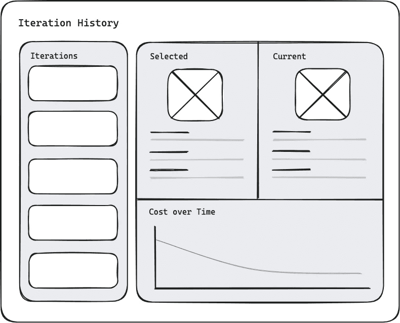
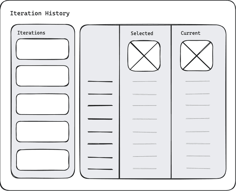
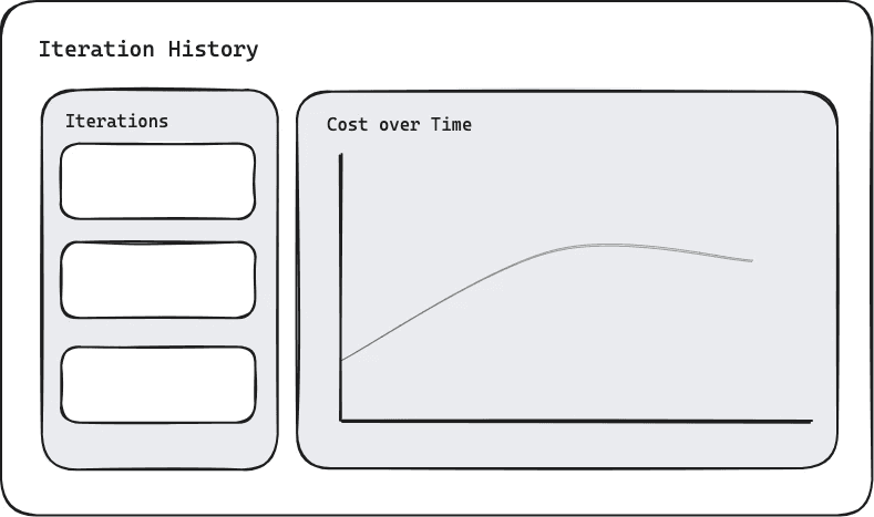
Exploring ideas through sketching
I used these requirements to sketch concepts and explore different ideas for the major decisions I needed to make. These sketches helped wrap my head around different solutions and have clear communication with my stakeholders.
The main decisions I needed to make were:
Where should the feature live?
What should the feature be called?
What's the best format for entries on the iteration list?
What's the best method for comparing simulation results?
If we use a chart, how should it be styled?
If we use a chart, how do we let users adjust the chart lines?
What's the best layout and styling to accommodate everything?
Where should the feature live?
Challenges
Stakeholders often pushed back against major changes
There were existing issues on the simulation screen regarding visual hierarchy and information architecture
Decision
Place the feature within a modal
Rationale
I was more likely to gain stakeholder support if the design had less impact on the rest of the interface
A modal let me to design the new feature without accommodating or perpetuating existing issues
What should the feature be called?
Challenge
The Marketing team and I had different opinions on the best name for the feature
I recommended "Version History" as it's familiar to users from other applications. Marketing preferred "Progress" to help the feature stand out.
Decision
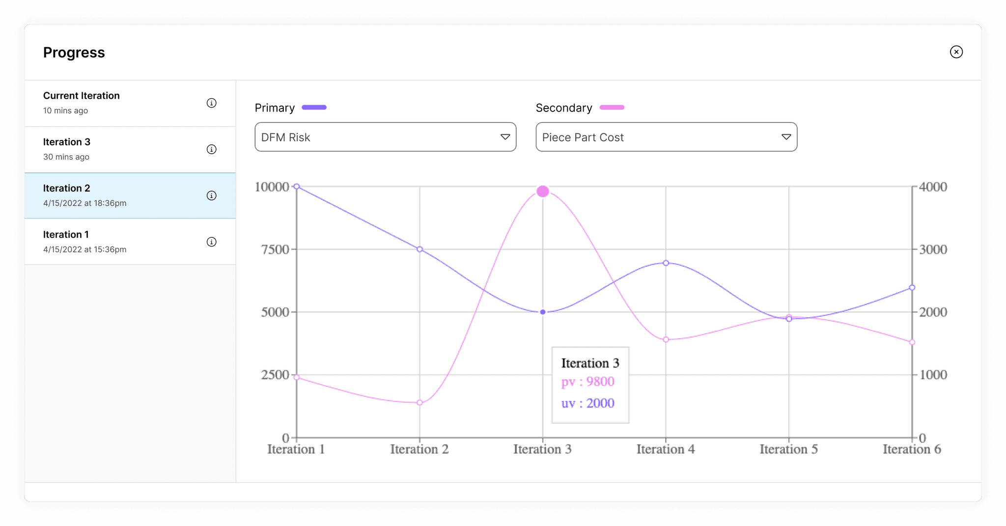
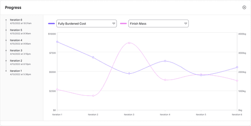
Use the name "Progress" for the first design iteration
Rationale
This gave me an opportunity to test the name I expected would have the highest risk. If users reacted poorly, I would have a stronger case for using a more familiar term.
What's the best format for entries on the iteration list?
Challenges
Designing the list of iterations with enough data to differentiate each one, but not so much that the list becomes unscannable
Displaying simulation inputs while keeping the primary focus on results
Decision
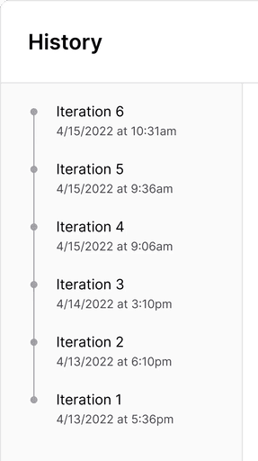
Include just the iteration number and creation date on each entry in the list
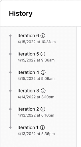
Include the simulation inputs in a tooltip
Rationale
The iteration number and date of creation are helpful pieces of data to differentiate iterations and are easily scannable in a list.
Putting the inputs inside a tooltip prevents them from distracting users away from results.
What's the best method for comparing simulation results?
Challenge
Allowing users to compare simulation results without being overly complex
I explored options that used a comparison table, line charts, and a mix of both.
Decision
Include just a list of iterations and a chart
Rationale
A design with both a chart and a comparison table would require a higher cognitive load for users and more development resources from our team.
Engineers already used charts with stakeholders, so I knew the format would work well. We could save them time by creating it for them.
If we use a chart, how should it be styled?
Challenge
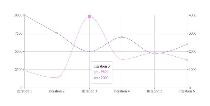
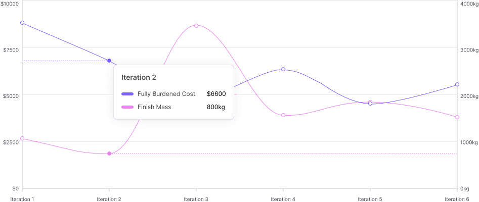
Designing an easily readable bi-axial line chart using the Recharts React library that fits in aP Design
Decisions
Apply typography and color from the aPriori Design System
Removing vertical grid lines
Add units to vertical axes
Add dotted lines to connect data points to axes on hover
Rationale
Using our standard fonts and colors will make the chart fit naturally in our app
Removing unnecessary elements makes the chart more readable my removing visual clutter
Without units, the chart would be unclear
These lines make it easier for users to know which axis to refer to for each line
If we use a chart, how do we let users adjust the chart lines?
Challenge
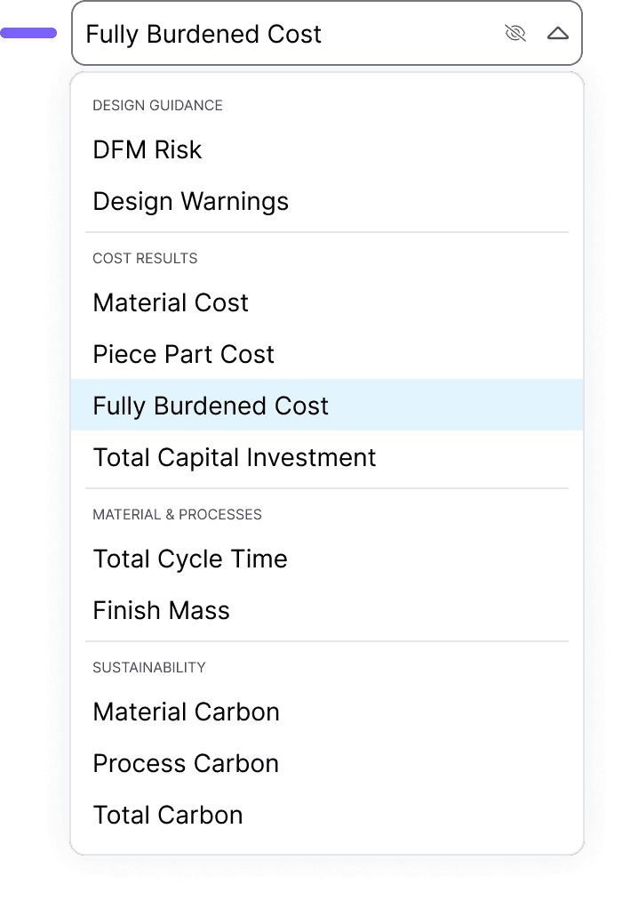
Designing simple interactions to change chart data and hide chart lines.
Decision
Use two dropdown inputs for each chart line with an icon button that hides them.
Rationale
There were about 10 options to accommodate, so a dropdown was an appropriate input field.
Our dropdown input fields used this same pattern with an "x" icon for clearing the input, so it should be familiar to users and be low effort for developers.
What's the best layout and styling to accommodate everything?
Challenge
Making the chart the primary focus and reducing visual clutter despite complex elements
Decisions
Make the chart take up a majority of the screen
Remove borders around each iteration
Put the iteration list on a low-emphasis background color
Make elements like the Info tooltip and Hide button appear only on hover.
Rationale
Giving the chart more space creates a focal element where we want users' attention.
Removing borders reduces visual clutter and makes the list more easily scannable.
A low emphasis background guides users' attention to the chart.
Making elements appear on hover reduces visual clutter so users are not distracted.
Usability testing with our customers
Now that the first iteration of the design was complete, I needed to test the assumptions I made and the feature's general ease of use. I ran usability testing with our customers to answer some important questions.
Usability testing and design updates
The design I created achieved some important successes during these sessions.
All participants successfully located the Progress feature.
All participants successfully interpreted the chart and used the tooltips to see details for individual data points.
All participants successfully used the dropdown selection to adjust the chart data.
However, there were also some failures and points of constructive feedback that I used to iterate and improve on my design.
Before
before
after

Several participants felt that the term "Progress" did not match their expectations.
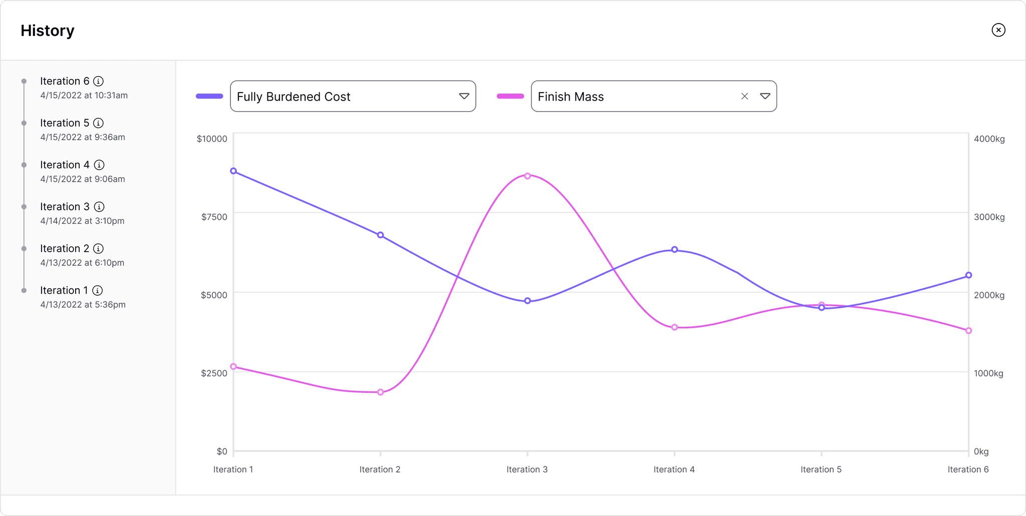
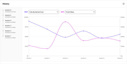
I renamed the feature "History" to use a term our customers would be more familiar with.
Before
after
One participant had difficulty reading the chart due to the thin plot lines.
To prevent this issue for other users, I increased the thickness of the lines and darkened the pink color to exceed the minimum 3:1 contrast ratio specified by WCAG.
Before
after
Multiple participants failed to hide chart lines or view iteration inputs due to affordances that only appeared on hover.
To solve this, I made these elements visible at all times. I also updated the dropdown component to use an existing pattern in our application where users click an "x" icon to clear the selection.
Measuring success
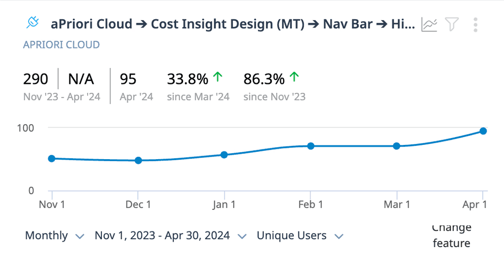
After releasing the History feature to all aP Design customers in November 2023, I collected data regarding feature adoption using Gainsight PX.
daily active user increase
The History feature saw nearly double the amount of users in it's sixth month post-release compared to its first.
adoption rate
As of April 2024, approximately 30% of users who ran at least one cost simulation also used the History feature.
Feedback
We also had multiple people reach out directly to express their satisfaction with the History feature.
“[Customer] saw the new chart in aP Design and loved what it provides… When they saw the release notice, they got very excited.”
Customer Success Manager
“Pretty cool! This will definitely help us.”
Customer
"This is sick functionality.”
Customer
Impact
After releasing the feature and seeing adoption in our user base, I could safely say that I achieved the following:
Reduced wasted time for our customers
They no longer needed to redo work to access critical data.
Streamlined customer collaboration
Our customers could present to stakeholders using our built-in charts rather than creating their own.
Reduced risk of rework internally
Catching usability issues ahead of release prevented my company from spending time and money to make changes later on.
Future Enhancements
Over the following months, our team introduced further enhancements to the History feature and even fulfilled some of the specific requests we received directly from our customers during usability testing.
